Performance
We know that Oculus’ IR LED-based ‘Constellation’ tracking technology works great for the headset, but how does it translate to motion controllers?
When it comes to tracking fidelity, very well it turns out. Within the tracked area, I was essentially unable to move my hands humanly fast enough to get any dropped tracking.
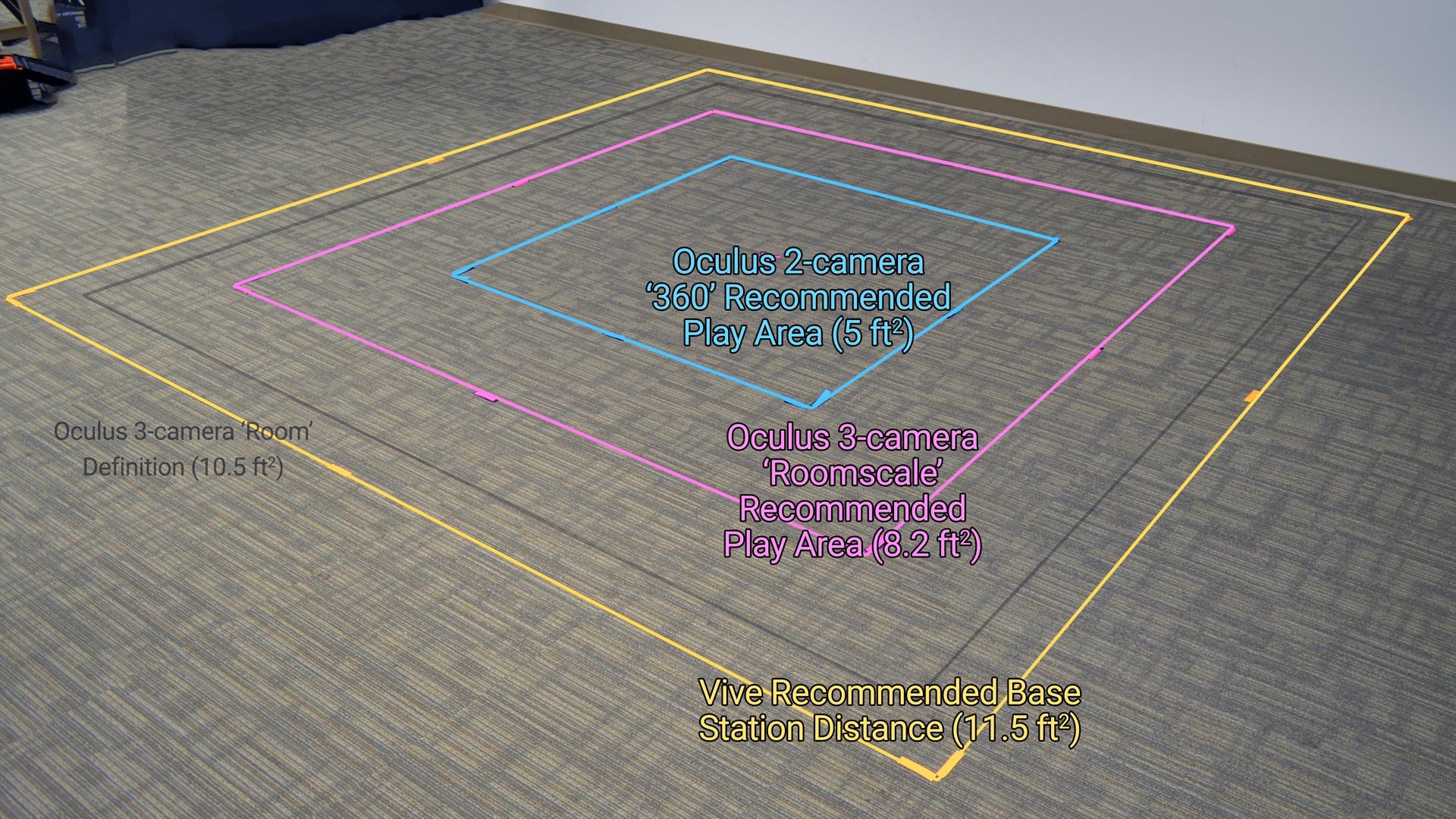
Oculus recommends three different camera setups, all optimized for different purposes. The first (2-camera Front Facing) is the one you’ll probably see the most often, because most developers are likely to target it. Oculus still considers the other two “experimental”.
 2-camera Front Facing
Oculus expects that for most people it’ll be relatively easy for them to place two Sensors on their desk a few feet apart, and that seems to be why they are pushing this as the default recommendation. With two cameras in front, this setup is aimed at front-facing experiences that make use of a roughly 180-degree area in front of you.
I was surprised to find that with just two Sensors I was able to completely fill the ‘roomscale’ space that Oculus recommends when using three cameras. Of course, with both cameras in the front, I won’t be able to turn around without losing tracking on the controllers, but it’s still a spacious area to move around and it’ll give you a lot more breathing room in experiences like Super Hot and Quill than the 360 setup.
2-camera 360 Tracking (configuration guide)
In order to facilitate 360 degree tracking, Oculus asks you to move the cameras into the corner of your space, but they don’t suggest putting them very far apart. Although you get 360 tracking with this setup, you lose pretty much lose the ability to step in any direction before running into the Guardian boundary. This is only a 5 x 5 square, and I was surprised how small it felt when I traced the boundary right around it.
3-camera ‘Roomscale’ Tracking (configuration guide)
If you want the biggest recommended space of 8.2 x 8.2 ft and 360 (which Oculus calls ‘roomscale’), you’ll need to pick up a third Sensor ($79 from Oculus) and place it in one of the two rear corners of your space. We showed in the video above that you can hit the same size space with the 2-camera Front Facing, so adding the third camera doesn’t seem to be about adding more space, it’s just to allow 360 tracking and further prevent occlusion of the controllers.
Depending on your PC, you may run into USB bandwidth issues when using the 3-camera setup; Oculus recommends plugging two of the Sensors into USB 3.0 ports and the third Sensor into a USB 2.0 port to try to distribute the throughput across more than one USB bus. Even then, you might find that Oculus Setup isn’t thrilled with the capabilities of your USB ports, and you might need to fiddle with plugging your headset and Sensors into different USB ports until you find out what the system can handle. Fortunately, Oculus runs a test every time you plug in a Sensor (during setup) to tell you if everything is good or if one of your Sensors if having tracking issues.
4-camera Tracking
Oculus Home supports four Sensors simultaneously, but the company hasn’t offered up any specific 4-camera layouts. We didn’t specifically test a 4-camera layout, but from our tests of the other setups, it isn’t entirely clear that adding a fourth camera means a larger space, it may simply mean a more reliable space. It’s likely that more people will run into USB bandwidth issues with four Sensors as well.
Pushing the Boundaries
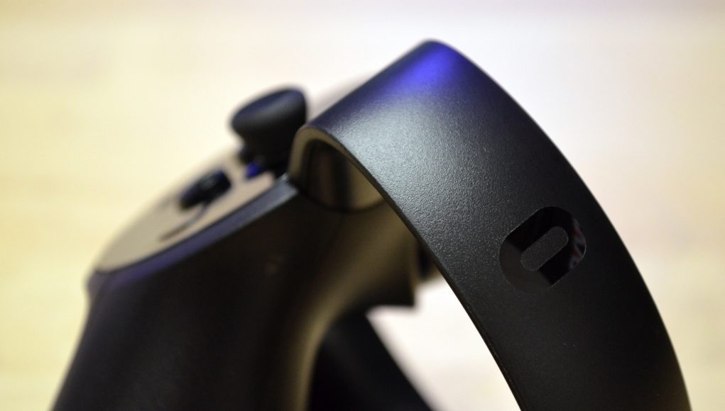
Oculus’ recommended sizes with each of these setups is pretty much guaranteed to work really well, but for those hoping they can fudge the boundaries, there’s not a whole lot of room. The tracking drop off comes quickly once you leave these recommended spaces. The problem seems to be largely with the face-on tracking performance of the controller, which has poor range compared to holding the cutlass edge-on (so that the band is facing the cameras), which allows you go much further before losing tracking. Unfortunately, with the controller’s primary orientation being face-on, the edge-on tracking performance is an infrequent best-case scenario. It feels like a missed opportunity; Oculus could have presumably made the cutlass shape a full dome and achieved a much larger practical tracking volume.
Hand Presence?
Presence (as I often write it with a capital P), is something special and specific; it’s different than the colloquial “immersion”, it’s a deep state of subconscious immersion that is achieved when certain minimum thresholds are met. It’s generally agreed that both Rift and Vive headsets can create Presence.
Throughout Touch’s lengthy pre-launch marketing, Oculus has maintained that the controllers are capable of producing “Hand Presence” which they’ve occasionally defined as ‘the feeling that your virtual hands are your own’. The company has subtly pushed this idea of Hand Presence as a differentiator to the Vive controllers. Oculus CEO Brendan Iribe recently revived the concept in the days leading up to the Touch Launch.
At Oculus Connect in October, some of the employees who built Touch claimed that Hand Presence was ‘only something that Touch can provide’. When I asked them what Hand Presence was and what specifically they mean when they say that only Touch can provide it, they declined to be more specific.
So for Oculus to claim that Touch has Hand Presence, and allude that Vive’s controllers do not, means they think Touch passes some threshold that convinces your subconscious that your virtual hands are your own—some threshold that Vive controllers simply don’t meet.
So does Touch have Hand Presence? Yes. But does only Touch have hand Presence? Well, without a specific definition beyond ‘the feeling that your virtual hands are your own’, I would say no. In my usage, Vive’s controllers are perfectly capable of making you feel like your virtual hands are your own in VR. Touch might be a major step forward in VR controller ergonomics over the current Vive controllers, but is there a significant experiential difference between the two that puts Touch uniquely into a new class of ‘Hand Presence controller’? Not really. Touch is an easy choice from a design and ergonomics standpoint, but feels no more usable for VR motion input than Vive’s controllers, even if it feels nicer to use in many ways.
Finger-sensing Buttons & Gestures
Oculus obviously doesn’t want to get specific about Hand Presence, but their claim might be about the controller’s touch-sensing abilities. The controller isn’t called Touch just because it lets you touch virtual worlds, it’s also because it can sense where you’re touching it. Every input on the controller is capacitive, meaning it knows when you’re touching (but not pressing) the A button, for instance, or when you have your finger on the thumbstick. You can also do a few simple gestures like pointing and thumbs up by some combination of press inputs and actual hand movements (a thumbs up, for instance, involves squeezing the hand trigger and then putting your actual thumb up in the air).
This allows your virtual hand to match the position of your actual hand on the controller fairly carefully, and while from one static pose to the next it might look convincingly like your hand, there’s something snappy and robotic about how the fingers move from one pose to the next in response to your own. You’ll often find people looking down at their hands and watching as they move their fingers around to see how the virtual hands react—sort of the opposite of Hand Presence. Eventually you’ll stop looking at your hands and start playing games with them.


