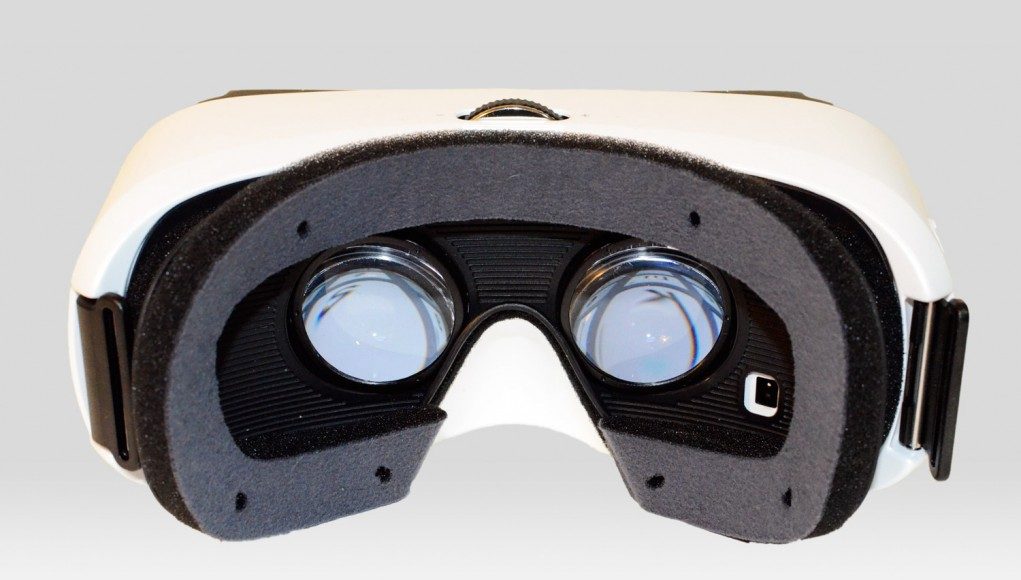
It’s been just a few days and I’ve already been able to wow more people with VR through Gear VR than in the last month with the Oculus Rift DK2. Mobility is one of Gear VR’s biggest assets; at times, it feels like a DK2 in your pocket. I’ve showed Gear VR to family, taken it to friend’s houses, used it in the car, and even while eating sushi. But mobility isn’t the only place where Gear VR shines; the device undoubtedly represents the most complete and polished VR user experience to date.
See Also: Samsung Gear VR Detailed Review: Part One – Design Comparison to Oculus Rift DK2
 If you’re an Oculus Rift user, you know the drill. Find a cool demo somewhere online, download it. Is it the latest version? Who knows. Should you run it in Direct or Extended mode? Who knows. Is there a Mac version? What’s the reorient button? What controls does it support? Will it even run on my computer? Gear VR, supported by Oculus’ all-encompassing Oculus Home experience, eliminates these questions and many more.
Yes, the Oculus Rift is explicitly a development kit. Oculus makes you check a box that says “I understand this hardware is intended for developers and it is not a consumer product,” before you can buy the unit. I am not faulting the DK2 for the questions listed above. But damn if it isn’t refreshing to have it all taken care of for you.
Oculus wants to deliver the same ease-of-use on desktop, but it’s making its debut on mobile. For all the talk of Gear VR being the “Innovator Edition,” (like a hardware beta), or as Oculus outwardly assures, still a development kit, I’m very impressed by the polish of the entire Gear VR experience.
Gear VR Experience
What’s it like to really use Gear VR? Well, let’s start from the beginning.
Oculus Home
First you grab your Galaxy Note 4 (the only phone compatible with Gear VR), and slide it into the micro-USB plug. Then you press down on the other end of the phone to lock it firmly in place. Put Gear VR on your head and you’ll be inside of Oculus Home.
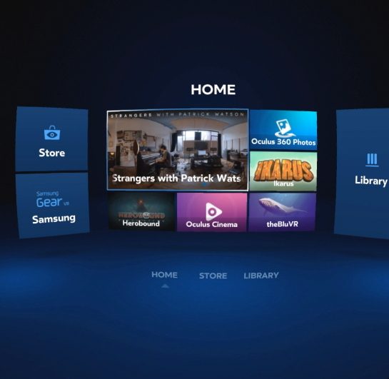
Navigation is handled through a combination of looking and swiping the touchpad on the right side of Gear VR. Occasionally there are times where this is inconsistent—you’ll think you can look to select something but you actually have to swipe over to it first—but on the whole it works fairly well and it’s something that will likely improve over time.
The Home menu shows recently used applications. On the left there’s a button to access the Store and a special section of the store for stuff from Samsung. On the right side is a button to access the Library, which consists of all of your installed VR apps. At the bottom of the view is three buttons to quickly navigate between those segments. When you look to select those bottom buttons, they actually rise up passed your cursor, requiring you to then look up to where they’ve moved, which is somewhat annoying. Perhaps for this reason, I found myself avoiding those bottom buttons and instead using other means of getting around.
Store
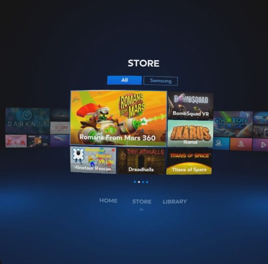
The Store will be familiar to anyone who’s used an app store, which is probably every single person reading this right now. Apps are arranged in attractive groupings of six. You can use the touchpad to scroll between groups, and use your head to highlight items within groups, while tapping the touchpad will select an item.
As of now, all apps are displayed this way in one big group. With 20 apps currently available, it’s manageable. But it’s clear that there will need to be more sorting and categorization in the future, lest you be stuck scrolling this way between hundreds of apps. That’s something that will obviously come with time.
While we’re talking about the swipe scrolling on the touchpad—it works, but there’s room for improvement. In most cases you are stuck with one swipe per scroll. So for instance, in the Store (see the screenshot above), one swipe will move that card in the background on the right into focus. But no matter how fast you swipe or how far, it’ll only ever move one position. For long lists this can be tedious because you may need five swipes to get to where you want to go and your speed is limited as you must wait for the prior animation to finish before swiping again.
I would advise Oculus to pay closer attention to Google Glass—I know Palmer Luckey, founder of Oculus has one—which has already spent a decent amount of time figuring out how to navigate a similar interface with just a touchpad, and they’ve devised a number of useful gestures. In Glass, you can give the touchpad a quick swipe and it’ll scroll through lots of items with momentum. That would be handy in Gear VR as well (it’s actually present in at least one of the apps). For now it isn’t a huge problem because most lists aren’t that long, however, as the Store grows, the need for a quick way to get around will become clear.
Installing Apps
Each app has its own little page which shows a title, cover photo, rating, and buttons for Install/Start, Summary, Details, Media, and Updates. Pay attention to the Summary, as it will tell you if the game requires a Bluetooth gamepad (Samsung has one which they sell optionally with Gear VR). Most games don’t require it, but it’s good to before installing, in case you don’t have one.
The entire installation experience is dead simple. Just look at the Install button and tap on the touchpad to select. The app starts downloading in the background and then you can go on your merry way. You’ll get a pop-up alerting you that it’s been installed. Oculus handles installations at a very low level, much like Android itself. In fact, if you start installing an app and then decide you’re done with Gear VR and remove your Note 4 from it, you’ll find that the app continues to install and you can check its progress via the Android notification menu—very seamless.
To answer a question up front: you cannot run VR apps from the Google Play Store (made for Cardboard or otherwise) in Gear VR. You’re restricted to what comes through the Oculus Store. That said, the initial batch of VR apps on Gear VR are varied and all very well made. And while Samsung definitely doesn’t sanction it, there’s a way to trick Gear VR into working with standard Android VR apps. More on that soon.
See Also: With 500,000+ Units Shipped, Google Just Got Serious About Cardboard
Games, Apps, and Experiences
Oculus currently splits apps into three categories: Games, Apps, and Experiences. While it’s easy to categorize most apps within these hoppers, there’s always a chance to blur the lines, especially between Games and Experiences. For instance, theBlu is a real-time experience that runs in a game engine, but since it’s only minimally interactive, it’s found a home in the Experiences category.
Right now, this categorization isn’t actually present in Oculus Home itself, but the Oculus Android app, which allows you to browse the Store and manage your library in a non-VR interface, allows you to sort the Store in this way. It’s likely that we’ll see these categories make their way into the VR end of things to help the sorting challenge that I mentioned previously.
Here’s everything available through the Store at the time of writing:
[one-third-first]
Games
- Proton Pulse
- BombSquad VR
- Romans from Mars 360
- Dreadhalls
- Andshar Wars
- Darknet
- Esper
- Ikarus
- Viral
- Minotaur Rescue VR
- Hero Bound First Steps
[/one-third-first][one-third]
Apps
- VR Gallery
- Oculus Cinema
- Oculus 360 Photos
- Oculus 360 Videos
[/one-third][one-third]
Experiences
- theBlueVR
- Titans of Space
- Cirque du Soleil’s Zarkana
- VR Introduction
- Strangers with Patrick Watson
[/one-third][clear-line]
Games
Games are the highly interactive and generally interaction-driven apps that you’ll find on Gear VR. While there’s a number of incredible classics that we’ve known from the Oculus Rift—Proton Pulse, Darknet, and Dreadhalls—I’m going to focus on some of the brand new apps that haven’t been seen before.
Romans from Mars
This is an adaptation of an Android game of the same name by developer SideKick. In VR, it takes form as a first-person defense game where you control a ballista, a giant spear launcher, used to defend a palace from little martians dropped off by UFOs, naturally. Essentially what’s been done here is Gear VR has transported you right into a game you’d expect to find on Android—a low-poly, cartoonish game—and it’s awesome. Suddenly you’ve gone from this little handheld and touch experience to a game where you feel like you’re actually standing inside that cartoonish world.
The game is quite a bit of fun, but as with most currently on the Store, it’s just a demo. Most developers plan to release full versions of their games once Oculus enables monetization in the Store, and that’s expected in 2015.
Still, from the demo you get a good feel for the mechanics. Your head is used to aim. Tapping on the touchpad or pressing the 1 button on the gamepad fires the ballista. You have to lead your targets because of the spear’s travel time, and the lead increases based on the target’s distance.
The entire interface is in-world, no HUD, which is great. To the left you can see a banner which shows how many lives you have left. Below is a chest full of gold which you collect by killing enemies. Gold is used to upgrade your ballista’s abilities through an upgrade menu that pops up in front of you between rounds. You can upgrade fire rate, crit chance, and damage radius.
On the right of your ballista is a bottle of mana which fills as you kill enemies. Swiping down on the touchpad (or a corresponding button on the gamepad) shoots down a bolt of lightning to destroy lots of enemies at once. Behind you on the right is a lever which allows you to switch between manual and automatic fire.
The game feels like quite a bit of fun and is plenty polished, but as it’s a demo, it doesn’t get challenging enough to know whether or not it will allow for strategy or simply chaos. There’s no multiplayer option yet, but it would definitely be fun to play with another Gear VR user, or maybe even cross-play between the standard Android app and Gear VR players!
Herobound
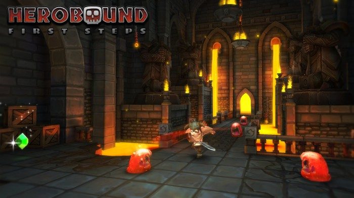
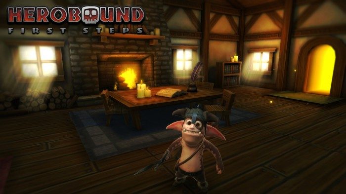
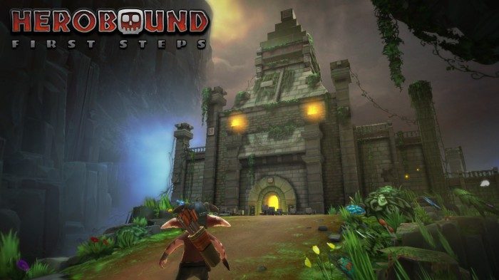
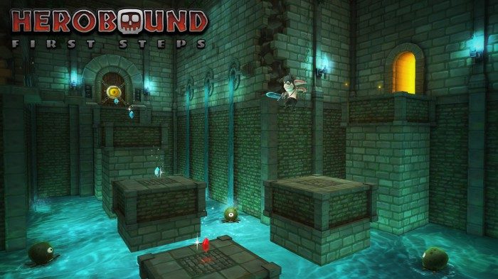
Herobound, which some of you may be familiar with from its working title, VR Quest, is a Zelda-esque dungeon crawler that’s built from the ground up with an inventive VR layout. This is a first-party app developed by Oculus, and the company has gone all out, creating rich and frequently beautiful environments.
You play as a little sword-wielding goblin. You’ll set out from your house to the overworld and find yourself before a massive volcano with smoke and fire billowing from its top. To your left is a fire-themed dungeon, and to your right, a water-themed dungeon. In front of you, at the base of the volcano, is a massive gate. A sign tells you that you need to recover an item from the fire and water dungeons before venturing into the volcano dungeon. Hmm… now where have I done something like this before?
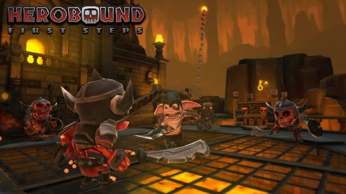
Herobound’s gameplay is well trodden territory—but certainly still fun—though the game’s achievement is its bar-setting visuals and comfort. Oculus has made very interesting use of this game’s layout for VR comfort and mobile optimization. The game is played from a third-person perspective and your head is always in a static location—it never moves with the character. When you enter a dungeon your perspective is up high, looking down at your character and little creatures in a room that’s completely in front of you. The rooms vary in size and you’ll turn left and right as you track your character, but there’s never the need to turn more than 180 degrees. As you move from one room to the next, your view fades to black and then a new room comes into view.
The various rooms do a great job of making you feel like you’re really inside of a place. You’re watching this action unfold from a higher perspective, but you’re very much there in the room with your character and the enemies. The rooms vary in design and some of them are really cool. You may find yourself looking up in a room within the water dungeon to find that the ceiling of the room has collapsed and beyond it lies a massive cavern. Some rooms are adorned with ancient statues that feel like they have a role to play in the game’s (so far non-existent) story. Others have terrace hallways up above the action that beg you to wonder where they might go.
The game requires a gamepad. The left stick controls your character’s movement. The 1 button will swing your sword—three quick taps will initiate a little combo that does more damage on the final swing. One of the buttons makes the character roll, which is useful for dodging and getting away from groups of enemies.
In dungeon-crawler fashion, there’s gems to collect and (limited) loot to find. Things start out slow as you move from room to room, with varied but not terribly distinct enemies. The gameplay starts to mix up as you get deeper into the dungeons and especially as you find new equipment.
One standout for me is several rooms in the fire dungeon that are completely dark, save for a few torches placed around the room and the one you’re carrying. Ghosts haunt the darkness, and their mesmerizing red glowing eyes are the only thing you can see until you reveal the rest with your torch. It was pretty creepy the first time I encountered these enemies, seeing only their eyes, knowing that they were lurking in the darkness waiting to attack my character. The ability of the Note 4’s screen to produce deep blacks is a huge benefit to these scenes.
Later in the fire dungeon you’ll find a better sword. It has a bit more reach and more damage, but the gameplay is fairly straightforward until you find the bow in the water dungeon. The bow is aimed by your looking position, and you’ll find red targets scattered about the game, often up high, encouraging you to look around the spaces; hitting those targets unlock doors or secrets. This mechanic gives the game a new layer of depth. The water temple seemed to be home to more platforming sections and more varied enemies, including some water-dwelling creatures that fire ranged attacks, and a kraken-like tentacle that can only be dispatched with the bow.
Herobound is a lot of fun and after an hour inside the game I still have more to play. I look forward to seeing what surprises await in the volcano dungeon.
Ikarus
Ikarus is another mostly third-person perspective game where you control a little figure down below. It’s developed by Uber Entertainment.
The game interestingly switches from third person to first person to perform specific actions, like operating a crane or pressing a button to ride an elevator. The game doesn’t require the gamepad, instead you issue movement commands by looking where you want your character to go and tapping the touchpad. The character has a mind of its own and will find the shortest path to the point which you’ve directed them.
The opening of the game has your character, a young woman, and her father crash landing a biplane on some sort of massive floating structure. A huge robot comes to take the woman away, but her father defends her and is taken instead. From there, she heads off on a rescue mission.
In the demo you’re running along small pathways with maintenance robots on patrol. You will have to direct your character to move at the right time so they don’t spot you. You’ll partake in a few simple puzzles on the quest to find her father.
The demo is over pretty quickly and there’s still work to do on helping players understand when to initiate certain actions (like getting out of an elevator), but being able to control a character in an environment like this with nothing but the touchpad is a very smart idea and one that we may see more commonly as more games are crafted for Gear VR. I’m looking forward to getting a bigger helping of Ikarus to see what other kinds of puzzles and action are in store.

