Even if you’re an Android fanboy, there’s no denying that Apple knows how to market. Some Apple haters might go so far to say that marketing is the only thing Apple does well—otherwise how have they managed to turn ‘copied ideas’ into billions? No matter which side you fall on, it’s clear that Oculus is borrowing from the Apple marketing playbook.
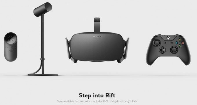
“Step into Rift” (sic)
This is perhaps the earliest sign of Oculus’ very Apple-like approach to marketing themselves and their products, and one that has stuck out to me from very early on.
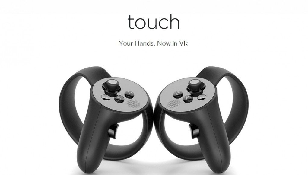
As far as Oculus is concerned, their VR headset is called ‘Rift’. Not the Rift, mind you. Just… Rift. They do the same thing for ‘Touch’, their virtual reality controllers. Watch this video and listen for every time they say “Touch”. You will never hear the word “the” come before it. You’ll also spot this all over their marketing material:
You’ll hear the exact same thing any time Oculus CEO Brendan Iribe talks about ‘Rift’ or ‘Touch’ on stage. Once you notice it, you’ll never not be able to notice it again… sorry about that.
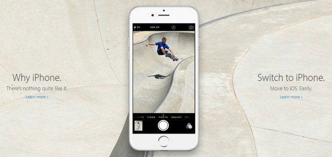
Apple does the very same thing and has been doing for a long time, at least as far back as the original iPod reveal in 2001. Find any official marketing, whether it’s a keynote from CEO Tim Cook or marketing on their website and you’ll just about never hear ‘the iPhone’. It’s just ‘Enjoy iPhone’, ‘Look at iPhone’, ‘iPhone is amazing.’
My hypothesis is that they are trying to update the product from a ‘thing’ to an ‘entity’, hoping to elevate it in your mind above everyday items. Technically they are constructing the sentences in a way that refers to the product as a proper noun instead of a common noun. Proper nouns in grammar denote specific, important things.
Consider the sentence ‘you’re going to love the Rift’, compared to ‘you’re going to love Rift’. The former refers to ‘the Rift’ as any old version of that item, while ‘Rift’ refers to a specific entity or concept, just like the difference between ‘a dad’ and ‘my Dad’.
I imagine it would be argued by the people making this decision that we store the concepts of proper nouns differently than common nouns; by elevating the product to a proper noun though language, they can move the idea of the product to that special place that our brains reserve for people and important things, instead of in that place where we put any old thing like ‘a fork’ or ‘an orange’.
No Specs
The world of PC marketing had long been entrenched in spec battles, where more bullet points and bigger numbers were used to one-up competitors. Apple came along with the opposite approach, marketing the experience, and shying away from specifications.
If you go to the official iPhone 6s page on Apple’s website, you’ll notice only the most minimal specifications (about the camera). The company doesn’t list the battery life, weight, display resolution, or size of the phone. And the most specific they get about the processor is that it’s using an ‘A9 chip’, with no mention of gigahertz or cores or RAM. (Compare that the Google marketing the Nexus 6P where they specify ‘Qualcomm® Snapdragon™ 810 v2.1, 2.0 GHz octa-core 64-bit CPU and Adreno 430 GPU’).
Oculus is pulling the exact same thing, perhaps even more extremely than Apple does it. On the official Rift page, there are literally no specifications for the headset. No field of view, no resolution, no refresh rate, no weight, no IPD, no nothing. And that’s because, like Apple, they’re marketing the experience rather than the specs.
Just listen to this fluffy experiential copy (complete with proper noun usage of ‘Rift’):
Rift is unlike anything you’ve ever experienced. Whether you’re stepping into your favorite game, watching an immersive VR movie, jumping to a destination on the other side of the world, or just spending time with friends in VR, you’ll feel like you’re really there.
Minimalism and Industrial Design Focus
Let’s just take a look at the Rift page and the iPad Pro page side by side:
Are we seeing any similarities? Thin font, check. Lowercase letters, check (even though they want the Rift to be known as a proper noun). Buy button underneath a tiny line of copy, check.
Consider also these marketing videos offering extreme emphasis on the design of the product:
[gfycat data_id=”DopeyTameCow” data_autoplay=true data_controls=false]
[gfycat data_id=”GlisteningUnlinedLangur” data_autoplay=true data_controls=false]
Oculus’ emphasis on design has made them very Apple-like from the get-go, and now we’re seeing it reflected with a very similar marketing style that’s minimal, approachable, and experience-oriented.
With Apple expected to enter the virtual reality field at some point soon enough, it will be interesting to watch Oculus try to out-Apple Apple themselves.

