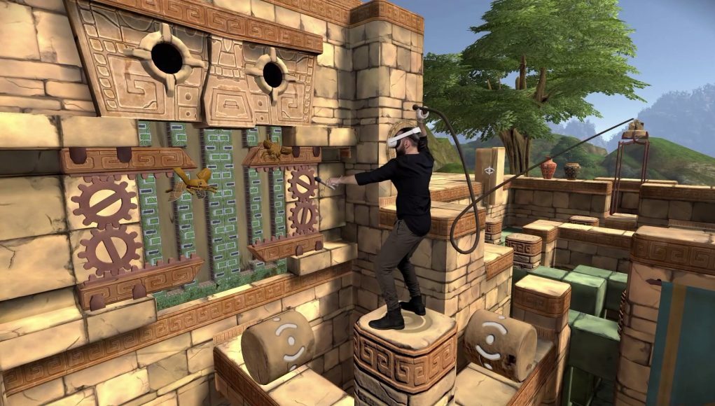
Eye of the Temple is one of the rare VR games that focuses on not just on pure room-scale movement, but dynamic room-scale movement. The result is a uniquely immersive experience that required some clever design behind the scenes to make it all work. This guest article by developer Rune Skovbo Johansen explains the approach.
Guest Article by Rune Skovbo Johansen
Rune Skovbo Johansen is a Danish independent game developer based in Turku, Finland. His work spans games and other interactive experiences, focused on tech, wonder, and exploration. After positive reception of the 2016 VR game jam game Chrysalis Pyramid, he started working on a more ambitious spiritual successor, Eye of the Temple, and at the end of 2020 he quit his day job to pursue indie game development full-time.
In Eye of the Temple, you move through a vast environment, not by teleportation or artificial locomotion, but by using your own feet. It makes unique use of room-scale VR to deliver an experience of navigating an expansive space.
In Eye of the Temple you move around large environments using your own feet
But how does it work behind the scenes? To mark the upcoming release of Eye of the Temple on Quest 2, I wanted to take the time to explain these aspects of the game’s design that I’ve never fully gone into detail with before. In this article we’ll go over a variety of the tricks the game uses to make it all work. Let’s start with the basics of keeping the player in the play area
Keeping the Player in the Play Area
Say you need to go from one tall pillar in the game to another via a moving platform. You step forward onto the platform, the platform moves, and then you step forward onto the next pillar. But now you’re outside your physical play area.
Moving platforms are positioned in a way to keep players inside the play area
If we instead position the moving platform to the side, it goes like this: You sidestep onto the platform, it moves, and you sidestep onto the next pillar. Since you took a step right, and then left, you’re back where you started in the center of the play area. So the game’s tricks are all about how the platforms are positioned relative to each other.
Now, to get a better sense for it, let’s look at some mixed reality footage (courtesy of Naysy) where a grid representing the play area is overlaid on top.
Mixed reality footage with a grid overlaid on top which represents the play area
Keeping an Overview in the Level Design
Now that we’ve seen how the trick works, let’s take a look at how I keep track of it all when doing the level design for the game. First things first – I made this pattern, which represents the player’s entire play area – or the part of it the game takes advantage of anyway:
A pattern representing the physical play area
As you can see, there’s a thick white border along the edge, and a thick circle in the center.
Every platform in the game has a designated spot in the play area and a pattern overlay that shows what that spot is. For platforms that are a single tile large, it’s generally one of nine positions. The overlay makes it easy to see if a given platform is positioned in the center of the play area, or at an edge or corner.
The play area pattern overlaid on each platform and its end positions make it easy to see if they are lined up correctly in the level design
Additional overlays show a ghostly version of the pattern at both the start and end positions of a moving platform. This is the real trick of keeping track of how the platforms connect together, because these ghostly overlays at the end positions make it trivial to see if the platforms are lined up correctly in the level design when they touch each other. If the adjacent ghostly patterns are continuous like puzzle pieces that fit together, then the platforms work correctly together.
It still took a lot of ingenuity to work out how to position all the platforms so they both fit correctly together and also take the player where they need to go in the virtual world, but now you know how I kept the complexity of it manageable.
Getting the Player’s Cooperation
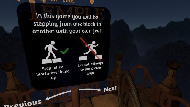
The whole premise of getting around the world via these moving platforms is based on an understanding that the player should step from one platform to another when they’re lined up, and not at other times. The most basic way the game establishes this is by just telling it outright to the player in safety instructions displayed prior to starting the game.
One of the safety instructions shown before the game begins
This instructions is shown for two reasons:
One is safety. You should avoid jumping over gaps, otherwise you would risk jumping right out of your play area and into a wall, for example.
The other is that the game’s system of traversal only works correctly when stepping from one platform to another when they line up. This is not as critical – I’ll get back to later what happens if stepping onto a platform that’s misaligned – but it still provides the best play experience.
Apart from the explicit instructions, the game also employs more subtle tricks to help ensure the player only steps over when blocks are correctly aligned. Consider the following example of a larger 2 x 2 tile static platform the player can step onto. A moving platform arrives from the side in a way that would allow the player to step off well before the platform has stopped moving, but that would break the game’s traversal logic.
In this room, ‘foot fences’ are used to discourage the player from stepping from one platform to another when they are not correctly aligned
To avoid this, “foot fences” were placed to discourage the player from stepping over onto the static platform (or away from it) at incorrect positions. The fences are purely visual and don’t technically prevent anything. The player can still step over them if they try, or right through them for that matter. However, psychologically it feels like less effort to not step over or through a fence and instead step onto the static platform where there’s a gap in the fence. In this way, a purely non-technical solution is used as part of the game’s arsenal of tricks.


