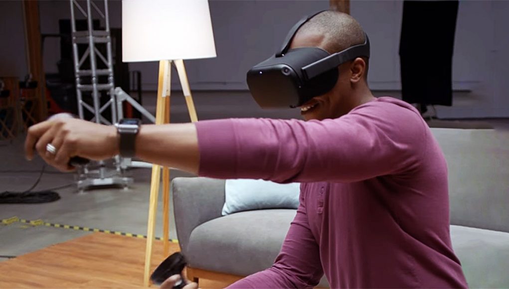
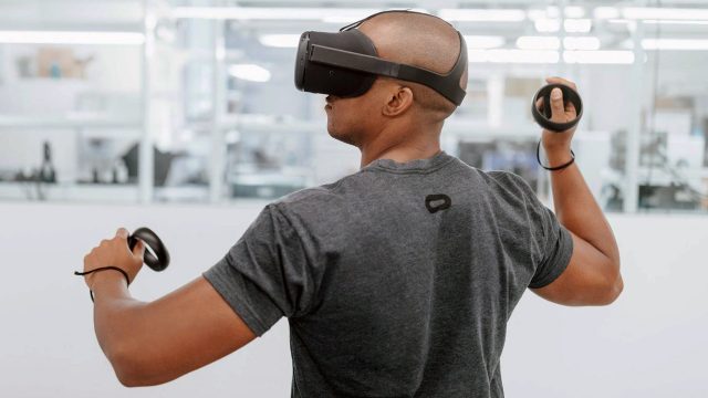
Today at Oculus Connect 4, the company’s annual developer conference, Oculus revealed the Project Santa Cruz ‘Prototype 2’ standalone VR headset, including 6DOF motion controllers. Though it might not look obviously different at a distance than the original prototype showed off last year, up close it’s clear that it’s actually a big step forward, including new lenses and a new display.
Following the Project Santa Cruz announcements during the keynote, including that dev kits will be in developers hands within the next year, I got whisked away to a behind-closed-doors demo of the latest version of the headset. Though the company announced another standalone headset today, Oculus Go, Project Santa Cruz is a different device entirely; it represents the company’s work on a high-end standalone offering (whereas Oculus Go aims for the low-end, more like Gear VR). And while Oculus Go has already been productized and is set to launch next year for $200, Project Santa Cruz is still in the prototype phase.
Quickly, to clear up any confusion, let’s be clear that Santa Cruz is a standalone headset. That means it doesn’t rely on a PC for anything—it has everything on board that it needs for VR, including power and compute. That’s different than a wireless headset, which would be untethered, but still rely on a host PC to do the rendering and computing. Because Santa Cruz is a standalone headset, the idea is that you can use it anywhere, and the inside-out tracking ought to give you essentially unlimited tracking volumes.
Now that we’ve got that out of the way, back to the demo. I wasn’t able to take any videos or pictures, but I got a fairly close look at the device and I can tell you what I saw and experienced.
One more quick note: the headset I tried today had stamped on the front, ‘Santa Cruz Prototype II’, and so I’m going to call it the Santa Cruz P2, whereas I’ll call last year’s prototype the P1.
Hardware Changes From P1 to P2
Form Factor
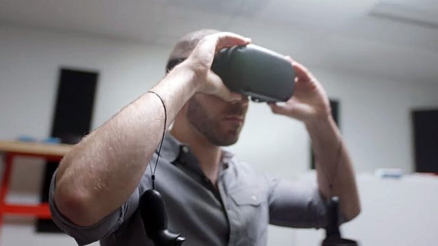
So, while the Santa Cruz P1 was essentially a Rift that was hacked together with a mobile compute/battery module attached to the back, and a new faceplate featuring the inside-out tracking tech on the front, the Santa Cruz P2 has a completely reworked form-factor which builds the compute/battery components directly into the display enclosure. So there’s no big bulge on the back like there was with the P1.
Display & Lenses
In addition to condensing everything into the display enclosure, the headset appears to be using a new, higher resolution display and new Fresnel lenses. Like the Rift, the P2 retains a hardware IPD adjustment slider, but unlike the Rift, it also has volume buttons on the bottom.
Hidden Integrated Audio
The P2 has integrated speakers but they aren’t over-ear like the Rift, instead they are hidden in/near the headstrap; you can’t really see them, but you can hear them (and so can anyone standing nearby). I did notice 3.5mm audio jacks on the left and right of the headset, suggesting you’d be able to plug your own headphones in for a better and more private listening experience. Folks from the Santa Cruz team told me that the audio solution for the P2 isn’t finalized yet, so we could see this change.
Head-mount and Ergonomics
The head-mount on the P2 is also all new. While the P1 was using the same head-mount as the Rift (rigid straps with the triangle in the back), the new straps are rigid at the front but become soft and rubbery as they progress around the back of your head. While the Santa Cruz P2 appeared a little bulkier and felt a bit heavier than the Rift, I’m actually quite surprised at its size and weight considering everything that they’ve had to pack inside the display enclosure.
Controllers
As for the new P2 controllers, Oculus says that the same team that made Touch build the Santa Cruz P2 controllers, and it shows—they feel and work just like you’d expect with Touch, except now there’s a trackpad on the top portion instead of a joystick and buttons.
Experience
Upon donning the Santa Cruz P2 I was immediately impressed with the new display and lenses. Although there was plenty of aliasing present (after all, this is a VR experience running on mobile compute hardware), the resolution was a big step up from the Rift. The pixel fill factor also seemed quite good, doing a lot to reduce the screen door effect. Mura correction also seemed very good, further enhancing perceived clarity, though for mura I need to get a look at a wider variety of scenes than I was able to see this time around.
Given how dark the black colors were on the display, I’d be willing to bet we’re looking at an OLED panel, and given the resolution, it seems plausible Santa Cruz P2 could be using the same 1,440 × 1,600 displays found in Samsung’s new Odyssey headset. It can be tough to gauge, but I feel like I could see a faint bit of flicker from the display (some people are more sensitive to flicker than others), which makes me think the refresh rate of the P2 is not as high as the 90Hz that we’re used to on the Rift. More likely (especially given the increased resolution and limited compute resources) the P2’s display is running at 75Hz or possibly lower.
Tracking
Oculus told me that tracking on the P2 had been a major focus since the P1 was shown last year. Using wide angle cameras mounted on the corners of the display enclosure, the headset integrates four independent views for inside-out tracking, and now the same cameras doing the inside-out tracking also track the P2 controllers, similar to the Windows VR headsets.
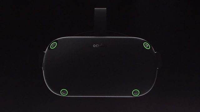
The company says they’ve worked to further increase the field of view of the cameras to create the largest tracking area they could in order to reduce the chance that the controllers would exit the tracking volume.
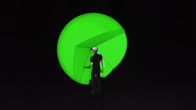
The tracking was quite good, and allowed me to walk confidently around a huge area of roughly 20 × 10 feet (the only thing that was stopping me from going further was the physical walls of the room). I’m so used to being inside of tethered headsets that it felt incredibly freeing to keep walking after several steps, when I would otherwise be approaching the edge of the playspace (or limit of the tether) in most other systems.
Oddly, I did notice a very small but consistent jitter when standing still and looking at nearby static objects. I say “oddly” because I don’t recall seeing the same jitter on the P1 headset last year. I mentioned this to some of the nearby Oculus folks involved with developing Santa Cruz, and they were surprised to hear that I could see any jitter; they encouraged me to return for another demo to take a another look (which I did and found the same visible jitter present).
Generally speaking, major players in the VR space (including Oculus) say that you need sub-millimeter tracking precision in order to avoid any visible jitter. If that’s true, then I’d have to guess that the Santa Cruz P2 prototype isn’t quite that precise. It’s close though, and arguably ‘good enough’ as it’s quite a bit more precise than PSVR (which has had no trouble moving units even with its greater than sub-millimeter tracking precision).
Despite the jitter, I didn’t see a single instance of ‘jumping’ (where the tracking system is briefly confused) in the head tracking which is a good sign. Granted, like last year, the demo room I was in (decorated like the inside of an apartment) didn’t have anything shiny on the walls, like mirrors or windows, which can be particularly challenging for optical tracking systems. So we’ll still have to wait and see how performance holds up in truly real-world conditions.
Controllers
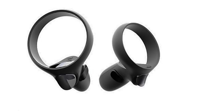
Last year at Connect, the Santa Cruz P1 just showed off inside-out headset tracking. This year with the P2 they have thrown 6DOF controllers into the mix. These look a lot like Touch, except with the tracking ring flipped upside down. That’s of course to make the hidden IR LED markers more visible to the on-headset cameras, whereas Touch wants to make them visible to off-headset cameras opposite the user.
The controllers have a comfortable grip that feels very similar to Touch, including the trigger and hand-trigger. The major change other than the placement of the tracking ring is a trackpad on the top of the controller rather than buttons and a joystick (for now the trackpad is not used). And the controllers seem lighter.
Overall, the tracking felt very responsive, and, at least in the demos I played, it felt almost identical to using Touch. However, I did notice that my hand seemed to shift a bit when moving from one camera’s view to the next, similar to how a moving object doesn’t always pass seamlessly through a stitching line in a 360 video.
For the kind of demo I played (Dead and Buried)—mostly casual shooting gameplay—it may not matter that much if the player’s hands tweak their position somewhat as they pass from one camera view to the next. I could however see this being a bother for some situations, like art and design applications, where, for instance, you wouldn’t want your brush stroke to get a kink in it as your hand moves between camera views. So we’ll have to hope this can be smoothed out if Santa Cruz is going to work well for all VR applications.
Audio
The decision to use integrated speakers in the P2, rather than headphones, was probably made with the aim of creating a headset with low weight, high portability/durability, and quick setup. If the P2 used the same on-ear headphones as the Rift, you might be worried about them breaking off if you throw the headset in your backpack. By removing them, they’ve potentially created a more robust product, not to mention reduced the weight, and a quicker fit when you put on the device.
To me the speakers sounded high in treble and without much bass; definitely a worse soundstage than I’m used to with the Rift. It also seemed much harder for me to understand where the spatial audio was coming from within the virtual world. Though, again, I can appreciate the thought behind this approach.
Thankfully, the 3.5mm headphone jacks (yes, plural) should mean that players can their own headphones if they like. There’s a 3.5mm jack on each side of the headset, and presumably they’re both mono jacks which would, together, offer left and right channels. I would hope that each jack could potentially also handle stereo audio output so that users could use their own headphones rather than be stuck with proprietary headphones with separated left and right audio plugs.
Ergonomics
As I mentioned, I was actually pretty impressed with the size of the P2 headset given everything that they’ve crammed into it. That said, it still feels a little bigger and heavier than the Rift, so I hope they can cut that down yet further before launch.
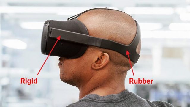 The new stretchy rubber head strap actually seemed quite comfortable to use. Not only was it easy to put on, but the rubber can better conform to the back of your head, whereas the shape of the Rift’s rear rigid head strap (the triangle area) is really only ideally suited for someone with one particular head shape (since it can’t flex).
And whether it is objectively better or not, it feels easier to pull the P2’s rubber strap into the optimal position, whereas with the Rift’s rigid strap I see people mis-fitting it constantly; so if Santa Cruz sticks with the rubber strap route, it could be a net positive to comfort simply by making it easier for more people to figure out the optimal fit. Of course, it really takes more time with a headset to assess true long term comfort.
– – — – –
Feel free to drop a note in the comments below if you’ve got additional questions about my time with the Santa Cruz P2 headset.

