Designing an Experience
Spring 2015, SteamVR + HTC Vive (Developer Edition)
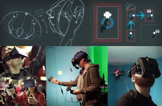
After GDC, people loved roomscale; it was a new feeling for everyone. But we still had a game to build. Whatever we made for roomscale had to play into the full-scale levels we had been designing for The Gallery up to that point.
The new freedoms of positional tracking, artificial locomotion, and variable heights all at once were almost too much. They contradicted the core feeling and pacing of the experience we’d designed. We needed constraints. And a new type of comfort.

We experimented with rapid locomotion prototypes to see what landed. The goal was to align our locomotion with how we wanted the player to perceive the game. More advanced techniques felt superfluous and worked against the tone and feel of our slow-burn exploration. We were also a small team of seven and we had to consider player-fatigue—something we had no metrics on.
How long could players explore inside VR before they felt eye strain or exhaustion? How much mental load, between advanced controls and puzzles, could a player bother with on top of that? And that was yet to even consider nausea.
Instead of being limited to sitting or standing in one position like with the Hydra or DK2, SteamVR had its own issues: Players were literally running into walls. We needed to find a way to redirect players to the center of their physical space, so they had the maximum area to work, play, and explore. Like with the GDC Elevator Demo, we didn’t want the player to feel like they were constrained to just their room.
Artificial locomotion—traditional gamepad movement—was the jumping point. We experimented with play bounds (the ostensible walls of the virtual roomscale volume) overlaying as a grid when the player moved forward with the analogue stick. Then we simulated head bobbing like in a traditional FPS.
Our ‘Body Joystick’ approach had you at the center of your room, with any offset direction and distance from that position representing the directional vector and velocity of your movement—you used your body as the controller. ‘Arm Joystick’ used the motion controller itself like a flight stick (a similar method is known today as ‘Onward-style movement’).
I was stuck on the idea of grabbing space and came up with a concept for ‘VR Handlebars’. You could reach out and grab, and, as soon as you latched, a virtual handle would appear in that space. It looked like the holodeck; right when you grabbed forward, the whole entire world would move toward you. In The Gallery it went over like a fart in a spacesuit, but ultimately found a fitting home in zero-G experiences like Lone Echo.
All of these methods worked against the feeling of our experience. And all of them made you feel like you were going to fall over. If you accelerated instantly, you’d get a lurching in your stomach. If you accelerated gradually, you’d get a different lurching in your stomach.
At the time, the few metrics we did have indicated that artificial locomotion wasn’t working for players. Now, with roomscale, it wasn’t working for our game either.
Blink and You’re There
Summer 2015, SteamVR + HTC Vive (Developer Edition)
One of the first forms of teleportation I worked on was ‘Astral Navigation’. You would look up in-game and see a star path between the clouds that represented the layout of the level you were in. Aim to where you wanted to go and, when you looked back down, you’d have teleported to that point in the scene. Impractical, but we were trying to explore the upper limits of what we could do with movement.
At this point, Valve put out an early photogrammetry scan of their office (a rough point-cloud version similar to the current SteamVR Environment below). In it were various ‘information’ nodes that you could teleport between to navigate the room. Rather than use artificial locomotion to slide around, you could zip from node to node. We instantly liked it—it felt cool, and it didn’t make you sick.
SteamVR hardware had elongated the tether to the computer, but we still had a cord to fight with. In a game with exploration like The Gallery, players were getting wrapped up and tangled when they tried to spin around. Immersion broke as they fixed themselves, their tangled cable, and their orientation in-game. We decided to take Valve’s teleportation nodes and augment them to support rotation.
The first question was how best to align players in an open level to have access to the interactions that we predicted they would want.
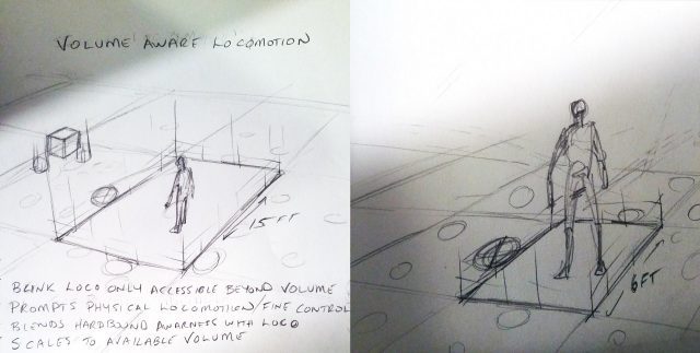
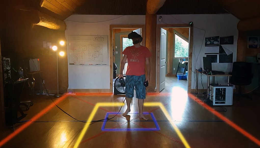
I prototyped a way for players to raycast their playspace by holding the touchpad on the controller. They could then use their thumb to aim and rotate where they wanted to go, see a projection of their bounds, and know what they would be able to reach within those bounds at their destination. We could then snap their playspace to an ideal node when they teleported.

By mid-2015, we were getting closer. We removed the nodes and just let players teleport wherever they wanted to, within our set parameters of height and distance. This nausea-free locomotion meant that we could help direct the experience while still giving players their freedom to move. It also offered a bridge for players new to VR to visualize and strategize their position regardless of their local space limitations, essentially giving roomscale gameplay to any room size.
Persistent bounds were important for that. When used in conjunction with artificial locomotion, visible boundaries were helpful as a stable point in the periphery to mitigate vection issues and nausea. With teleportation, they served to make the player feel safe within their space; play bounds could dynamically pop up when you came too close to a surface. When the player knew where they could safely move to, they were less likely to just stand in one spot.
Instead of an instant zort to a new location, which hurt the pace of how we wanted the game to feel, we did a fade-to-black ‘Blink’—another eye technique. The duration of the Blink was directly proportional to the actual distance you wanted to travel. We wanted that passage of time to feel realistic, so you couldn’t just Blink to the other end of the world in an instant. I worked with our sound designer, Joel, to nail down the timing, and he added foot foley so you could actually hear yourself walking as you Blinked.
It was all about the feel.


