The Content Side
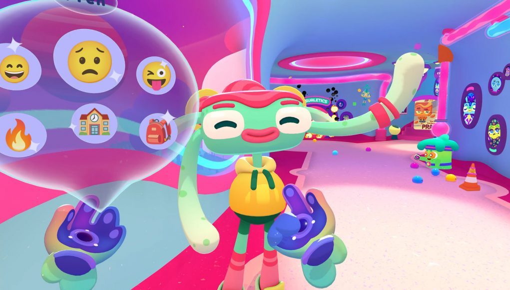
Having these modules and drivers gave the content team a wide array of tools to create CH’s many interactions. Rather than creating a new script for each interaction, our team got to play puppet master using all the ‘strings’ of code provided.
At first, our backend structure required that each ‘string’ (a module or driver) receive content separately. Lines of dialogue, emotions, the character’s gazes, and so on were each slotted into a list and triggered in sequence.
No Time for Fun
Working this way limited the ability to do fine timing. Figuring out exactly when to change a character’s expression by timing out how many (milli)seconds from the beginning of a dialogue line that change should occur was tedious and difficult. Additionally, any change to a line or updated audio broke well-timed sequences that then needed to be redone in the same manner.
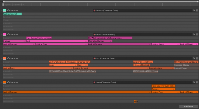
Later in development we created the character sequence tool, which allowed manipulating all these elements together on a flexible timeline. This meant emotions, gaze targets, and gestures could all be controlled right in line with dialogue.
This was sufficient to make the majority of character content in the game lively and responsive. However, certain moments called for a little more drama.
Mocap Studio
For moments of heightened emotion, we used our mocap studio. Built as a tool to enable more complicated animations to be made by anyone on the team, the mocap studio tracks and records the placement of a headset and controllers and maps them onto our characters. This let us motion capture our animations – and do so for specific lines of dialogue.
Through the mocap studio anyone at Owlchemy could access the script, play any audio clip, act and capture their performance for that line, and save it directly to the audio data and character sequence.
BFFs
Developing expressive characters was essential to Cosmonious High feeling like school. Achieving that effect while limiting the scope of our bespoke animations meant creating robust systems and layering them on top of each other. Bringing all those tools together with a usable interface in character sequences made it usable for anyone at the studio, and allowed us to bring our space children to life.


