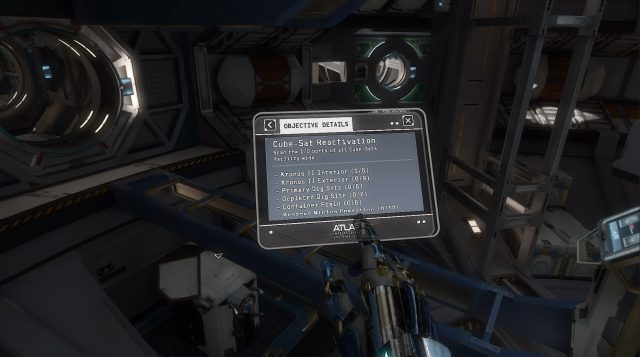
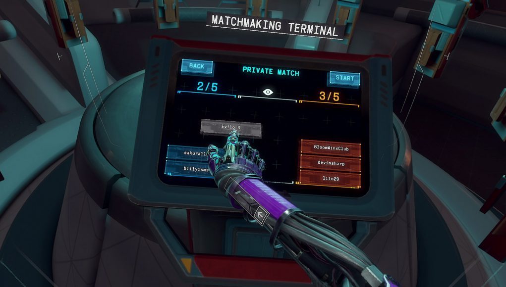
Lone Echo nabbed our 2017 Oculus Rift Game of the Year Award for many reasons—amazing visuals, intuitive locomotion, and a strong story, to name a few—but one of the game’s unsung innovations is its virtual touchscreen interfaces. While many VR games are still using less than ideal laser pointer interfaces, developer Ready at Dawn created a framework for surprisingly functional virtual interfaces which are both intuitive and immersive. The studio’s lead systems designer, Robert Duncan, joins us to explain the design approach behind the end result.
Guest Article by Robert Duncan
Duncan is the Lead Systems Designer at Ready At Dawn Studios, where he enjoys collaborating with the entire team in the pursuit of awesome. He loves to create compelling, emotionally engaging experiences and stories for others to enjoy, all while ravenously consuming those same types of experiences across a variety of mediums: games, movies, TV, anime… to name just a few. He also loves cooking, physical crafts, and tabletop games (especially with miniatures), and even more so when sharing those experiences with others. To that end, he’s excited about the storytelling power of VR and the incredible social opportunities it provides.
Objective System Goals
Designing the various user interfaces in Lone Echo and Echo Arena—from simple mechanical interfaces like pull-levers, all the way up to complex virtual interfaces like Jack’s augmented-reality touchscreens—was a process that involved an exciting amount of exploration and iteration. Given the unique constraints that come out of developing for VR, we found ourselves in a situation where we were all but forced to innovate just to achieve our most basic goals.
Fortunately, that innovation rarely had to be done from-scratch; in many cases we were able to pull inspiration from related disciplines (like physical product design or mobile interface design) while making clever adaptations for VR. To illuminate what that process was like, this article will take a deep-dive look into the design of the player character’s[1] integrated ‘objective system’ from Lone Echo, followed by a brief look at the various screens used in the multiplayer lobby of Echo Arena. However, explaining the what without the why wouldn’t be nearly as helpful, so to begin we’ll examine the overall goals that guided the objective system’s development:
Comfort: As with anything we create in VR, comfort is a chief concern. Eye-strain can be quite problematic, especially when considering the use of text.
Usability: While this arguably goes without saying, it is highly important that this system be easy and intuitive for players to use. Aside from the fact that these features are almost always beneficial to a system, they became all the more important when it was realized that we weren’t going to be developing a tutorial for the objective system.
Effectiveness: Again, while this goal seems obvious, it’s important to enumerate what would make the objective system sufficiently ‘effective’. First and foremost, it needs to help players figure out what they are supposed to do in order to make progress through the experience. As such, when critical progression information needs to be delivered, the objective systems needs not just to convey this information, but to even encourage the player to see it. Beyond such critical information, this system is also expected to offer players additional details about their objectives in case they need more thorough support. Lastly, it’s key that this system does not artificially imply linear action. That is to say, when players are allowed to do things in the order of their choosing, it’s important that this system doesn’t make them think they have to do them in a specific order, as we want players to embrace that freedom of choice.
Immersiveness: Given the incredible power of presence that VR offers, one of the chief goals for Lone Echo is to leverage that power as much as possible. Naturally, this extends to all systems of the game, but it’s particularly important for the objective system because it’s most likely to be used when players are close to having their immersion broken: if a player is getting ‘stuck’ and not sure what to do, they’re probably teetering on the edge of taking their headset off… the last thing they need is for their life-line (the objective system) to push them over the edge! This is tricky, because objective systems are notoriously game-y, abstract, non-immersive systems.
Feasibility: Though often overlooked due to its obvious implication, I find it’s important to weigh this practical goal alongside all the rest for one simple reason: if we can’t build it with the time and resources we have, the rest doesn’t matter! It won’t exist!
With the goals laid out, the next step is to determine a high-level design that will meet these goals.
High-Level Design
It’s not uncommon for even the high-level design of a system to change a bit over the course of development, especially as new information is discovered about how the game plays, what players need, etc. In the case of the objective system, we waited until fairly late in Lone Echo’s development before designing it, which fortunately[2] allowed us to dodge any need for significant high-level change. Here is the high-level breakdown of features that we landed on after carefully examining what Lone Echo needed:

Text-based Display: For the sake of feasibility, the tried-and-true means of conveying objective information via text seemed like the obvious choice: it would be easy to author and expand upon, and it could leverage known lessons from traditional gaming objective systems. As it turns out, figuring out comfortable typography in VR is a process all its own, but this ultimately was still the most viable solution for us to take. It is worth noting, however, that at one point we considered allowing players to replay the dialogue audio associated with an objective, but that feature was dropped due to time constraints[3].
Augmented Reality Theming: Fortunately, given the world of Lone Echo (and even more so Jack’s character as an AI), augmented reality is a highly appropriate way to contextualize the objective system. Furthermore, given that a common modern-day use-case for AR is conveying abstract concepts (e.g. travel directions), it’s that much more appropriate for an abstract system like objectives.
Conceptualized as a ‘To-Do’ List from Jack/Liv/HERA: This idea was important for determining how objectives are written and displayed… while many games simply allow this sort of system to exist as an abstract layer ‘on top of’ the game (accessible via a non-immersive pause-menu or the like), given our immersiveness goal, that level of abstraction simply wasn’t an option. Instead, we chose to gear the list of objectives toward something that Jack and Liv might actually use: a dynamically updated list of things to do, written through their perspectives. We found that this also helps reduce any artificial implications of linearity.
Predominantly Opt-in: In order to maintain the presence and exploratory feeling we were targeting for Lone Echo, we found that we had to strike a careful balance with how ‘in your face’ the system was while ensuring it still met its effectiveness goals. What we ultimately landed on (after lots of testing and sifting through a wide variety of player preferences) was a system that is predominantly opt-in and only grabs the player’s attention when absolutely necessary[4].
Now that the big picture is squared away, let’s talk details! The objective system (from a user-interface perspective) consists of two key elements: the wrist display, and the tablet. We’ll go over both in the following pages.
Continued on Page 2: Wrist Display & Tablet »
— Footnotes —
[1] For those unfamiliar, in Lone Echo the player takes on the role of Jack, an advanced AI (with an android body) working on a mining station within the rings of Saturn.
[2] One downside to this method was that we didn’t have a usable objective system for many of our focus tests. To get around this, we had our test proctors act as de-facto objective systems, giving players very constrained hints at the right times or when requested.
[3] A simplified version of this feature was leveraged to allow players to listen to the audio logs they obtained from Cube-Sats.
[4] Given the additional cognitive load players seem to experience while in VR, determining when (and how) to explicitly tell players what to do was a new challenge in and of itself!


