Hardware
Design
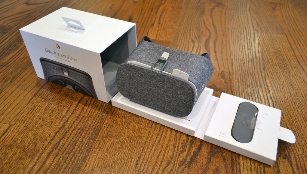
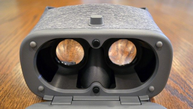
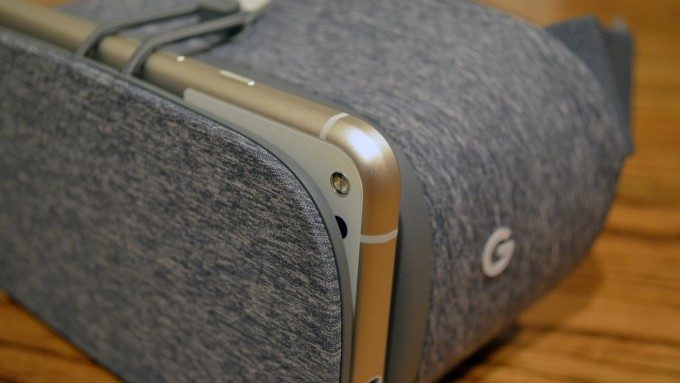
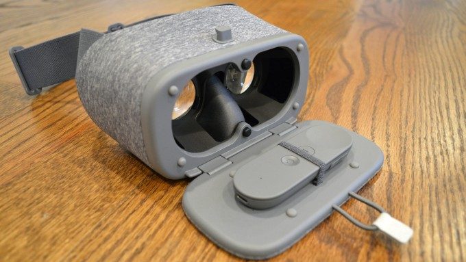
The Daydream View headset is cleverly designed to be inexpensive without feeling cheap. The device hides an extremely simple plastic skeleton structure which holdes two basic lenses (not far removed from what you’d expect from a Cardboard viewer), all shrouded in premium feeling fabrics. Unlike Gear VR— which has an on-board IMU, touchpad, fan, and microUSB port—the View is almost entirely devoid of anything but plastic and lenses, save for the simple NFC tag hidden in the front cover which allows phones to detect when they’re placed inside. The headset has no battery and doesn’t even need to plug into the phone.
This approach kept costs down and made headway to include the Daydream controller—which is a bit more complex than the headset, with a battery, touchpad, several buttons, and an IMU—yet still both come in at $20 less than Samsung’s $100 Gear VR headset.
Daydream View’s design simple keeps it light but the headset still feels resilient. While Gear VR feels like something to be worried about bumping, bruising, or cracking the View feels like it would be happy tossed into a bag (so long as it doesn’t get crushed).
The View is also designed to be adaptive to any Daydream ready phone. Different models of Gear VR have varying phone compatibility among a few different Samsung phones, but Google’s vision for Daydream is that all Daydream headsets will work with all Daydream phones, now and in the future.
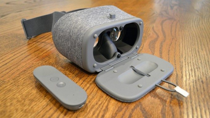
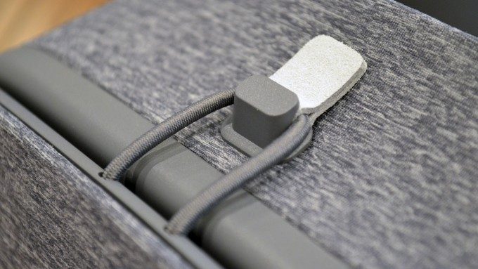
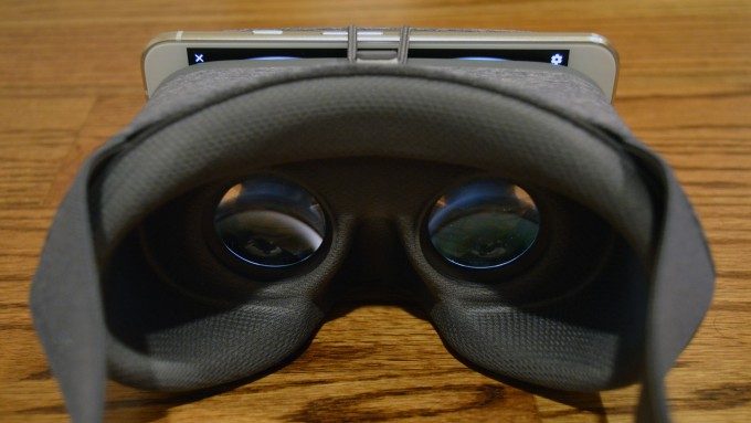
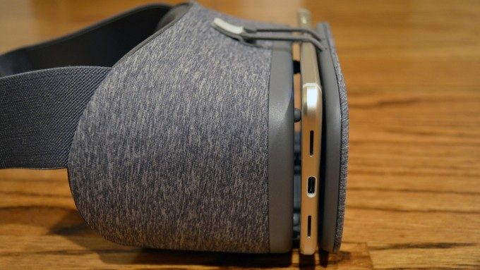
To make that happen, the headset’s front cover is largely open. Rather than snapping a phone into a carefully fitted structure, the headset relies mostly on some high-friction pads which sandwich the phone thanks to pressure from a spring-loaded hinge below and an elastic hook above. The spring-loaded hinge allows the View’s front flap to expand to fit phones of varying thickness, and the open top and sides make the headset adaptable to phones of varying height and width. There’s also two special black capacitive pads that touch the phone’s screen which the phone uses to align the virtual view with the lenses; that way you don’t have to obsess over getting your phone exactly aligned in the headset. Just set it down and latch the thing shut and you’re good to go in a few seconds.
It’s a smart design for adaptability across what Google hopes will be a vibrant ecosystem of Daydream ready phones, but comes with a major drawback (see Hardware > Light Leak and Lens Glare section).
Did I mention the headset looks good? Google clearly made the choice to try to disassociate the connotation of VR as ‘futuristic gadgetry’ and instead aimed to give it a familiar and somewhat fashionable feeling of clothing. A smart choice I would say, and well executed, for a headset that’s the start of a VR platform that the company hopes will go far beyond tech-centric hardcore gamers and gadget lovers.
Controller
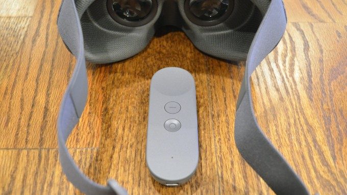
The Daydream controller is a fairly simple device that adds a lot to the experience. Even though it’s a ‘3DOF’ (rotational tracking only) device, being able to bring more 1:1 movement of your body into VR makes it that much more natural. Being able to point and click is so much more simple and intuitive than Gear VR’s approach of using a side-mounted touchpad that can easily lead to confusion between commands like ‘up, down, left, right, forward, and back’.
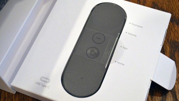
The design of the Daydream controller is extremely minimal, except maybe a bit too minimal, as the trackpad area is ill defined, save for an incredibly shallow bowl shape. When you’re in VR and can’t see the shape, you should be able to easily feel it, but it’s harder to feel than it should because the trackpad uses nearly the exact same texture as the rest of the controller; which is weird, because the two face buttons are well defined by feel: one is a (more severe) concave shape, and the other is flat with a raised tactile line. The trackpad redeems itself though by being not only useful, but also having a satisfying click that feels like just the right amount of pressure.
There’s also two handy volume buttons on the side of the controller so you don’t have to try to mess with your phone’s volume rocker while it’s mounted in the headset.
The controller is quite compact. For those with hands/fingers on the larger end of the spectrum, it may feel a bit smaller than desired, especially the small trackpad area.
The whole thing is powered from an internal battery that charges with a USB-C cable. The Daydream view headset doesn’t actually ship with one (probably to keep costs low), but Google is assuming you’ll have one from whatever Daydream ready phone you bought.
The controller works well and is a simple but smart addition to the mobile VR experience which adds a lot, but there’s one niggle that rather irks me. ‘Remote’ style controllers (those which are long and flat, and must be ‘pointed’ at their target), are not comfortable for long durations of pointing because they require you to cock your wrist at an entirely unnatural angle. Try this: reach out your hand like you’re gripping a remote that’s in the shape of a small cylinder (like a roll of quarters). Now imagine that in order to use that remote, you need to point the top of the cylinder at the thing you’re controlling; try that action and see the position in which if puts your hand—that’s the sort of cocked wrist motion that gets uncomfortable quickly.
It’s fine to hold your arm up to point your TV remote to change the channel for 5 second every 10 minutes, but if you’re channel surfing, you aren’t going to keep your arm held up or your wrist cocked continuously to keep the remote pointed at the TV.
With Daydream, you’ll want to keep your hand rested in your lap, which works fine, except when you need to point below the horizon (which is frequent), because then you’re pointing down into your leg, or required to hold the remote up uncomfortably.
A major component of this issue (pointing below the horizon) could be corrected by significantly tilting the angle of the virtual pointer so that the line doesn’t come directly out the top as if it was a TV remote with an IR blaster that literally needed line of sight to the receiver. It seems in some experiences the line is indeed tilted, but only by a few degrees. Tilting it down much further might field weird at first, but would likely be significantly more comfortable. There’s a reason that the barrel of a handgun is pointed at an extreme angle compared to the handle: because it’s way easier to aim.
Comfort
Daydream View is light and compact, but a big phone like the Pixel XL adds a significant 168 grams to headset, and puts it far away from your face, making it even more noticeable. Although the total View package of phone and headset weighs less than a smartphone-equipped Gear VR, the View doesn’t have a top strap, which leaves only your face and the back of your head to distribute that weight, and you’ll probably notice.
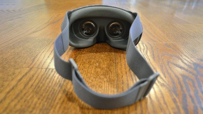
Without that top strap to alleviate some weight, the relatively small surface area of the View’s facial padding comes to forefront of the comfort conversation; you’ll no doubt be cognizant of the weight of the headset that’s focused mostly around your eyes, and wish (as I did) that the surface area of the facial padding was greater to better distribute the pressure.
Once I dialed in the tightness of the strap and found the ideal spot on my face, this wasn’t a dealbreaker for long term use, but Gear VR has a clear edge in comfort (despite being heavier), at least for my face. Since the facial interface seems to be a cheap piece (it’s held in with velcro and can be removed for hand-washing), I have my fingers crossed that Google can tweak it easily during the production of the View, or maybe folks like VR Cover will step in and offer a more comfortable third-party alternative.
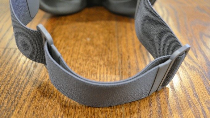
Speaking of the strap, since there’s just one, you’ll end up wearing it up around the top of the crown of your head to keep it from sliding down. This takes a little getting used to compared to top-strap headsets, but it works. Google eschewed the velcro-adjustment that we see on most other headsets and instead uses two plastic sliding loops on the elastic which tighten or loosen as you push them closer or further apart. The adjustment is quick and easy, but I felt like I had to re-tighten it every time I put the headset on, which left me wishing they just stuck with a velcro adjustment which wouldn’t shift on me between sessions.
Performance
Field of View
Google says Daydream’s field of view is 90 degrees (which may vary by phone), which on paper matches the first and second generation Gear VR, but is a bit behind the most recent generation (at 96 degrees). However, field of view measurements are far from standard, and in my experience with Daydream view, it feels to have a slightly smaller field of view than the first two Gear VR headsets; if we’re calling that 90 degrees, I would estimate the View’s field of view to be 80-85 degrees. It’s still enough to immerse you, but you will get a significant sense of binocular view compared to something like the Rift or Vive, which is unfortunately exacerbated by some lens-induced artifacts discussed below.
Light Leak & Lens Glare
The View is actually great when it comes to enclosing your eyes and preventing any light from getting in around your nose or elsewhere from openings around the facial interface, but due to its design to accommodate many different sized smartphones, there’s plenty of room for light in your external environment to leak in from the phone side of the lenses.
In the worst cases, an unfortunately positioned direct overhead light will illuminate every piece of dust on the phone’s screen and lenses, which is majorly distracting. Moving away from direct light will help, but even significant indirect light will lead to significant glaring. These issues are only significantly bothersome when you’re looking at dark scenes, but are otherwise drowned out by brighter virtual environments.
Even if you turn all the lights out in your room, you’ll still find some glaring issues due to the lenses. In high contrast scenes, especially with white objects/text on a black background, you are likely to see a complete halo of thin light around the edges of your view. That’s not only annoying, but it serves to literally highlight the headset’s limited field of view. Again, this artifact largely vanishes in brighter scenes, and will be less of a problem if we could convince developers to stop making VR title screens that have bright logos on a black background.
A bit of good news on the lenses though: in my brief time testing I had no issues with fogging. Unfortunately fogging is something that happens under specific conditions (with the most important variables being humidity and temperature), so it’s tough to conclude if headset is not prone to fogging, or if I simply haven’t run into the right conditions for it. I’ll stay on the lookout.
Image Quality & Latency
These factors will vary from phone to phone, but because Google is setting a minimum bar for phones to be able to qualify as Daydream ready, so most of what I’m talking about here applies specifically to the Pixel.
Resolution, Screen Door Effect, & Mura
With a 2560×1400 AMOLED display (same resolution as Gear VR), you’re going to be looking at an even sharper picture than what you’d find on desktop-class headsets like the Rift and Vive. That makes the Daydream View + Pixel great for VR videospheres and photospheres, and other pre-rendered content, but even with all those pixels it won’t feel graphically as rich as the Rift or Vive because the phone can’t handle the same levels of real time graphics.
The ‘screen door effect’ (visible gaps between pixels) is present, but so tiny that it largely fades away once you stop trying to analyze the pixels and start looking at the VR world constructed before your very eyes. The screen door effect on Daydream View + Pixel is less pronounced than on the Rift or Vive.
The mura correction is spot on, keeping pixel brightness highly consistent from one to the next, which aids in clarity, especially in dark scenes. While poor mura-correction is notable disappointment for PlayStation VR, most people probably won’t notice it at all on Daydream View + Pixel.
Refresh Rate, Low Persistence, & Black Smear
The Pixel (and to our knowledge, all forthcoming Daydream ready phones) runs at 60Hz refresh rate in VR mode (same as Gear VR). The latency definitely falls under that crucial 20ms threshold, leaving you with a smooth and convincing image that keeps the virtual world feeling solid around you even as you turn your head. Some people are very sensitive to flickering, which is more noticeable at lower refresh rates than higher ones. I personally can’t see any flicker at 60Hz on the View, but your mileage may vary.
Low persistence, a technique which reduces blurring during screen motion, doesn’t seem to be as effective on Daydream View + Pixel as it does with other headsets. This is likely a function of the lower refresh rate. This is particularly noticeable while keeping your eye on text while turning your head, but it’s harder to notice for general scenery, so consider this just a note, not a deal breaker by any means.
Daydream View + Pixel suffers from black smear, an artifact which causes dark areas of a scene to briefly smear across lighter areas during head movement. The issue is related to OLED’s ability to change pixel colors extremely quickly for all colors except for true black. This is something you’ll notice when you find small dark objects set against lighter objects, like dark rocks on a sunny beach shore, or black ships against a bright sky.

