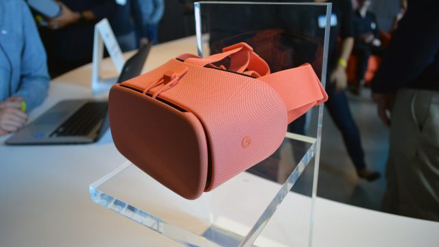
Google today announced the next iteration of their Daydream View headset for virtual reality on Android. We highlighted the changes and improvements in our announcement article, but how does it handle in practice?
After watching Google unveiled a range of new products during an event in San Francisco today, I got to check out the new 2017 Google Daydream View headset running with both the Pixel 2 and the Pixel 2 XL. For background you may be interested to read our 2016 Daydream View review.
Pixel 2 and Pixel 2 XL Differences
Off the bat, let’s quickly talk about the phones—while they’re mostly identical on the inside, the Pixel 2 XL has a higher resolution display and a larger screen (6″ @ 2,880 × 1,440 vs. 5″ @ 1,920 × 1,080). The result is a sharper image and a larger field of view when used for virtual reality. The Pixel 2 is fully capable of Daydream VR, but will sacrifice some image clarity and field of view. Oh, and yes, the original Pixel and Pixel XL will work fine in the new Daydream View, and the new Pixel 2 and Pixel 2 XL will work fine in the old Daydream View (2016).


Lenses
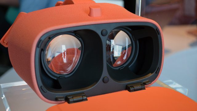
Onto the headset. It may look largely the same, but there’s actually some significant changes to the new Daydream View (note that Google isn’t calling this the ‘Daydream View 2’). The most obvious is the new lenses which are larger and have moved to a Fresnel design.


The result is a noticeably larger field of view (Google says by about 10 degrees over the original Daydream headset) which compares more favorably to Gear VR. Fresnel lenses have the potential to introduce ‘god rays’, an unsightly visual artifact that’s particularly noticeable during high contrast scenes (like white text on a black background). In my time with the new Daydream View I didn’t notice any that stood out, but they will be more or less pronounced depending upon the content, so I’ll need more time to do a deeper analysis. Usually Fresnel lenses are used to increase both field of view and the so-called ‘sweet spot’ (the area where the image through the lens is the sharpest); I’ll also need to play more to get a good feel for how large the sweet spot is, but, at least in my 15 minutes with the headset so far, I didn’t have any trouble finding a sharp view.
Display
Looking through the lenses, the Pixel 2 XL has an effectively identical PPI as the original Pixel XL (538 PPI vs. 534 PPI), so don’t expect to see a sharper image. The screen door effect (the spaces between the pixels) is somewhat visible, but more distracting than that was the somewhat poor mura correction (pixel-to-pixel brightness & color consistency). On the original Pixel XL, the mura correction was decent and not too distracting, but on the Pixel XL 2 the mura seemed to stand out, causing the appearance of a faint linen-like texture to cover the scene. Here’s an idea of what that looks like:
The problem with mura is that, like the screen door effect, it’s ‘stuck’ to your view, which means it moves when you move your head, which impacts immersion. I was surprised to see what seemed like a reduction in mura correction on the Pixel 2 XL (compared to the Pixel XL); I’ll need to double check to against a fresh device out of the box to make sure it wasn’t just a one-off issue (hopefully I’ll have a chance to do so soon).
Ergonomics
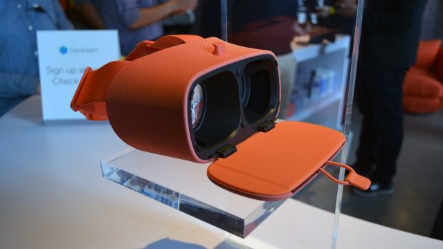
Then there’s the ergonomic changes. The obvious one is the new top strap which extends from the top of the lens enclosure, over the top of your head, and connects to the horizontal strap. This helps distribute the weight from your face to the back of your head. If you don’t like the top strap, it’s easy to remove. The facial interface (foam that touches your faces) has gotten beefed up a bit as well.
I could definitely feel the top strap taking some weight off of my face, and between that and the new foam, I hope the long-term comfort issue I had with the first Daydream View (too much pressure on the cheeks) will be taken care of, but with just 15 minutes in the headset I can’t yet say.
Phones Run Better in Daydream (yes, really)
Another major change is the heat sink that’s smartly built into the headset’s front flap. Google says this improves the phone’s thermal dissipation so much that it runs better inside that headset than out of it. That means the phone can maintain peak VR performance without having to dial back its power in order to prevent overheating. And to be clear, all Daydream ready phones, not just the Pixel phones, benefit from this.
Obviously I haven’t been able to test this for long term use, but Google claims they’ve tested the thermals in a range of conditions and have found that, with the new heat sink, the phones continue to operate at optimal performance even while continuously running the most demanding VR apps. They promise that users will no longer be bothered by reduced performance due to heat (though I’m going to assume that’s only true as long as developers follow best practices for making sure their apps don’t push the phone too aggressively).
Aside from these changes, it’s pretty much Daydream as usual—the software experience doesn’t really change (except perhaps running with more consistent performance thanks to the heat sink). You can also still pull the facial interface out of the headset and hand or machine wash it to keep it clean.
And while the design is pretty similar, the new material feels a little more refined and mature; Google definitely gets props for the external fit and finish of the headset, which looks and feels abundantly more welcoming than the ‘gadgety’ style of Gear VR (granted, the external looks don’t matter much when you’re inside!).
– – — – –
So when can you get your hands on one? Good question. The only release date Google has provided so far for the 2017 Daydream View is “later this year.” Though they have announced the price: $100, which is $20 more than the original.

