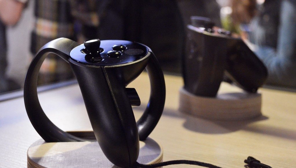
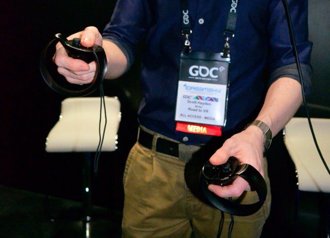
Oculus Touch won’t launch until the second half of 2016, but the company continues to iterate on the impressively ergonomic VR controller. We went hands-on with their latest prototype at GDC 2016 last week.
This article discusses the changes between the Touch Half Moon Prototype (mid-2015) and the latest Touch 2016 prototype. For a more substantial overview of my thoughts on Touch as a whole and how it stacks up to the competition, be sure to read our initial hands-on:
Oculus Touch is an Elegant Extension of your Hand for Touching Virtual Worlds
Although Oculus focused the spotlight on their gamepad-only launch titles at GDC, some of the most impressive Rift games we saw were built exclusively for Touch.
When Oculus first revealed Touch back in mid-2015 they showed us the ‘Half Moon Prototype’. What I’m calling the ‘2016 Prototype’ is the version of their VR controller that they first teased us with on the last day of 2015 (and were never shown in the flesh until after the New Year); the 2016 Prototype is visually distinct and no longer holds the ‘Half-Moon’ designation. Technically the version we tried was Touch ‘Engineering Sample CO6AC’.
First and foremost we can see that the Touch 2016 Prototype has had its IR-LEDs (part of the tracking system) covered over with IR-transparent plastic for a more sleek look. The rest of the shape has been tweaked slightly, most noticeably on the triggers and handles which are more rounded.
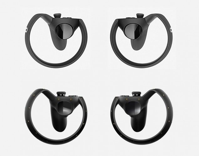
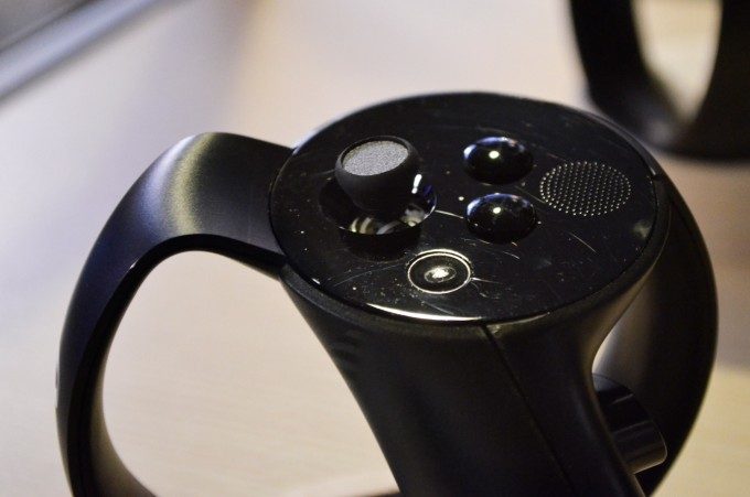
The biggest changes come to the thumbsticks and button layout. Although not included on the initial Half Moon prototypes, later Half Moon variants would see an ‘Oculus’ button included on the controller, and this has carried over to the 2016 Prototype (this will be used to access the Oculus Home menu). The Oculus button, along with the A/B/X/Y buttons (A/B on right controller, X/Y on left), have been scooted aside to make way for a small patch of tactile bumps.
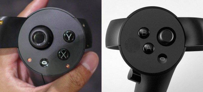
The bumps seem to serve as an indicator of the intended default position of your thumb, whereas the thumb’s resting position on Half Moon was actually on the buttons themselves. My guess is that Oculus opted to move the thumb’s resting position away from the buttons to prevent people from accidentally pressing them when using the controller’s ‘hand-trigger’ to grip objects (as the thumb is a natural part of the gripping gesture).
While the buttons, triggers, and thumbsticks on Touch are capacitive (touch-sensitive) to aid in posing the user’s in-game hand, it isn’t clear to me yet if the tactile area will be capacitive as well.
The resting angle of the thumbstick on the Touch 2016 Prototype has been tweaked slightly compared to Half Moon, as has its height. This seems to have made it somewhat easier to achieve a thumbstick ‘click’ when the stick is tilted.
See Also: Preview – ‘Dead & Buried’ Action Packed Multiplayer Could be the Killer App Oculus Touch Needs
When touching the 2016 Prototypes to each other, I could feel a magnetic attraction between the two controllers at the inside point where the tracking ring connects to the controller’s face. My best guess is that the magnetism has to do with the controller’s haptics, which may lend further support to the idea that Touch uses a linear actuator for haptics rather than the usual ERM motor that produces the rumble in many gamepads.
The haptics themselves seemed perhaps more powerful than before, possibly due to a change in position of the haptic components (which might explain why I quickly noticed the magnetism). Alternatively, it could be that haptics were simply better utilized compared to when Half Moon first went out the door and developers were still learning the best ways to use the feature.
See Also: Including Controllers, Vive and Rift Could be Evenly Matched on Price
At GDC 2016 we also got a peek at a box in which Oculus appears to be distributing Touch Half Moon Prototypes to developers. With styling akin to that of the consumer Rift case, we imagine Touch will eventually ship in something similar.
Although the company is distributing the device to select developers, they don’t intend to launch an open dev kit.
To my hands the Touch 2016 Prototype still has class-leading ergonomics (even compared to the Vive’s newest VR controllers) and the tracking works as well as ever. The ‘hand-trigger’ in particular is an exceptionally well executed idea, affording users an intuitive ‘grab’ function while leaving their trigger finger and thumb free for further interaction. The HTC Vive controllers of course have a similar grab button along their length but its placement doesn’t lend itself to being continuously held as a virtual ‘grab’ while still allowing natural use of the controller’s remaining buttons.
Oculus plans to release their Touch VR controllers in the second half of 2016. The cost of the controllers (and additional tracking sensor) is still unknown.

