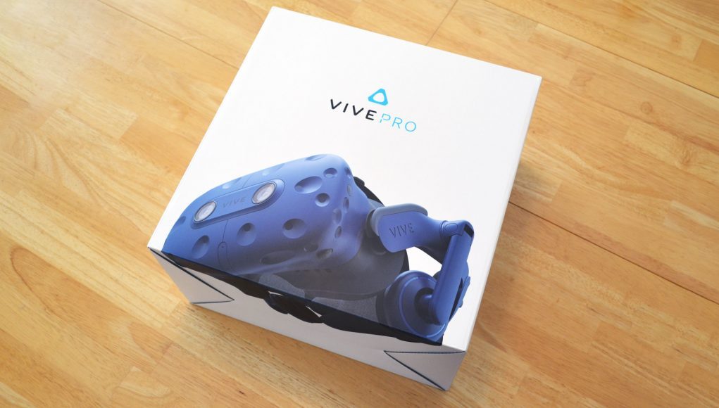
Design & Ergonomics

At first glance the Vive Pro looks a lot like a blue version of the original Vive + Deluxe Audio Strap accessory, but upon closer inspection, it’s actually a more substantial redesign. While the plastics and overall feel are similarly sturdy, the Vive Pro’s faceplate has been redesigned with tweaked sensor array, dual microphones, stereo cameras, and a much better mechanism for the headset’s lens-to-eye adjustment.
Lens-to-Eye Adjustment

Regarding the latter, a new button on the bottom of the faceplate allows the whole thing to easily glide back and forth, increasing or decreasing the distance between your eyes and the lenses. For maximum field of view you’ll want this pushed all the way in, but those with glasses or long eyelashes will appreciate how much more easily this can be adjusted. On the original Vive, you had to pull out two grey knobs on the sides of the headset and then spin them simultaneously to make the same adjustment. Not only was it a little clunky in practice, in my experience few people were even aware the adjustment existed.
Head Mount
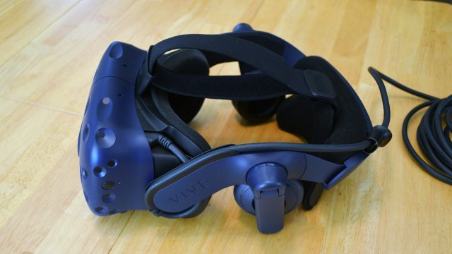 Moving onto the head mount—this is also a redesign rather than a simple color change for the Deluxe Audio Strap. The Vive Pro head mount looks bulkier from the outside, but I found it to be notably more comfortable, probably thanks to the extra foam and the way that it swoops away from the sides of your head, while cradling the back of the head a little more comfortably.
Everyone’s heads are a different shape, so I wouldn’t be surprised if there are some that prefer the Deluxe Audio Strap, but everyone will be able to agree that both are better than the original Vive’s default soft headstrap. The Vive Pro head mount is also easier to adjust than the original soft headstrap because there’s a single knob in the back for side tightness (instead of two velcro adjustments), and the cable runs along the side of the head mount rather than over top, which makes the top strap infinitely easier to adjust.
Comfort
After adjusting it for a while to find the right combination of tightness and how high (or low) to optimally place the back strap, I was comfortably able to use the Vive Pro continuously for sessions of two hours or more. I found myself regularly making small adjustments throughout, but that was more to keep my eyes in the Sweet Spot than for comfort’s sake. Be sure to remind people that ‘tighter isn’t better’ when it comes to finding the most comfortable way to wear the headset, you need to play with it to find where it really feels good.
One annoyance I have with the strap is that when I look down at a steep angle, like toward at something on the ground in front of me, it has a tendency to slip ‘up’ my face a little bit. This probably has to do with the way it’s balanced, and the interplay of frictional forces that are used to keep the headset snug to your skull. Not a huge problem, but it could be annoying for a game where you do a lot of looking down at an angle (like a tabletop game).
New Cabling and Link Box
The Vive Pro cable and corresponding link box has been redesigned and is more simple than before. Instead of three generic plugs that would go into the headset and the control box, the Vive Pro has a single proprietary connector the attaches to the headset above the left eye, and neatly routes around the left temple, up over the left strut, and to a retaining loop on the back of the head mount. The ‘temple loop’ of the cable allows the entire display assembly to rotate independently of the head mount without tugging on the cable.

The cable terminates in a single proprietary connector which plugs into the link box. On the other side of the link box, there’s mini-DisplayPort and USB (which run to the computer) and a power input. The link box now has a power button allowing to manually turn the Vive Pro on and off. The original Vive’s link box used to have an HDMI input, but that’s been removed. And just so it’s clear, the Vive Pro can’t be used with the original Vive’s link box, and vice-versa.

Also worth mentioning is that the Vive Pro now has a hidden, extra on-board USB-C port (while the original Vive used to have a standard extra USB port). It’s very well hidden—you’ll need to remove the foam padding (which is attached by velcro) and then carefully pull a section of the plastic facemask away from the headset to reveal the port. When I did it, I practically thought It was going to break the piece, so you might want to consult the instruction manual to make sure you’re doing it right before you yank on it too hard.
Audio
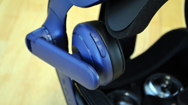
HTC has made a big deal about the Vive Pro’s new headphones and onboard amplifier, going so far as to have the headset “High-Res Audio” certified. Unfortunately a “known issue,” according to HTC, is causing the headphones to be missing a huge portion of bass frequencies. They say they are working on the issue, but haven’t given a timeline on when it might be fixed. In the meantime, that leaves the headphones sounding pretty crappy for sounds in the lower range. Gunshots and explosions sound especially hollow.
To my ears, it seems like the distance from the drivers (held quite far from your ears by thick padding) could be to blame. When I push the headphones closer against my ears, a lot of bass gets added. It isn’t clear to me if the present issue is a fundamental hardware design problem, or just some sort of output issue.
In the meantime, even though it’s must less convenient than having on-board audio, you may want to use your own headphones. The Vive Pro’s headphones can be removed and you can use a pair of USB-C headphones (or an adapter to 3.5mm), however the bulky head mount isn’t entirely ideal for over-head headphones, so earbuds might be a better fit.
The sooner HTC can get the Vive Pro headphones fixed, the better, because each headphone has a handy hidden function. On the back of the left headphone is volume up/down buttons, and on the right is a microphone mute button. Both super handy to have just a button click away.
Cameras
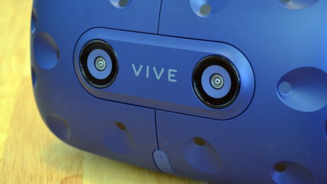
Back when the original Vive launched, the single front-facing camera was touted not only as a convenient way to peer outside of your headset, but also as something that developers could and would do all kinds of neat stuff with later down the road. Well, not only was the default ‘tron mode’ filtering of the camera’s view (which made everything blue with awful thick outlines) enough to make people never want to use it, but to date we haven’t seen any compelling uses for it dreamt up by developers.
The Vive Pro now comes equipped with not one, but two front-facing cameras, arranged as a stereo pair. Theoretically, you could use them for lots of neat stuff: inside-out tracking, hand-tracking, pass-through AR, SLAM, etc. But once again, nothing like that is available out of the box, not even stereo-passthrough video.
Upon activating the headset’s camera mode, you’re presented with the same filtered ‘tron mode’ view as before, taken only from the right eye camera. While you’re in that mode, the headset’s microphone is piped into your ears, making it easier to hear someone talking to you outside of VR.
We’d love to see interesting things done with the cameras, but it seems HTC is once again hoping that developers will come along and unlock their capabilities.
– – — – –
Overall, the design of the Vive Pro is hardly prettier or sleeker than before, but it does have a few nice user-centric improvements which make it easier to use and more comfortable.
The Room-scale Elephant in the Room: SteamVR Tracking 2.0
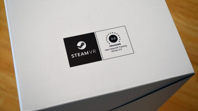
One of the Vive Pro’s biggest purported improvements is new sensors supporting SteamVR Tracking 2.0, which is supposed to enable cheaper base stations with better performance and—most valuable to enterprise/commercial customers—much larger tracking volumes (up to 33 × 33 feet). The only problem is that you can’t actually buy the SteamVR Tracking 2.0 base stations or controllers from HTC yet, which means this important part of the headset’s value proposition can’t yet be tapped into or tested.
HTC says that’s coming later this year, but for now is bewilderingly asking customers (who don’t already have it) to drop $300 to buy SteamVR Tracking 1.0 equipment while they wait for the SteamVR Tracking 2.0 hardware to become available.
Conclusion
[This conclusion mirrors the conclusion in the Summary section on the first page of this review]
The Vive Pro brings nice improvements, but when you zoom out and look at the (current) difference in experience between the original Vive and the Vive Pro, it’s hard to make sense of the asking price—even for the enterprise/commercial demographic, since they can’t currently make use of the headset’s (eventual) larger tracking volume.
A ‘pro’ headset should definitely have best-in-class resolution, but it should be paired with ‘pro’ lenses too. Unfortunately the Vive Pro feels held back by the limitations of the original Vive’s lenses (which it borrows).
Maybe I’m just caught up in the regular progression of other sorts of consumer electronics devices, but two years after the release of the original Vive, the Vive Pro feels like expected progress which seems like it should have been priced—for the complete system, with 2.0 tracking base stations and controllers—no higher than the original Vive’s launch price.
Questions?
Anything we didn’t address that you want to know about? Join us in the comments below for further discussion!
Disclosure: HTC provided Road to VR with a Vive Pro headset.

