Spatial Interface Selection
We quickly realized that the simplest system would be to pinch and then release the Powerball. This would let you execute a single shortcut command, switch between two modes, or even cycle between more than two modes with successive pinches. However, the real utility of a shortcut system comes from having quick and direct access to a range of options. So we explored systems which displayed more than one shortcut and involved moving the pinched fingers into predetermined positions to choose one.
Our first step was to investigate comfortable ranges of movement. We found a few movement patterns which felt easily repeatable without strain. The first was rotating our pinched fingers down and inwards by rotating our wrist and forearms.
Another was tilting our pinched fingers forward or backwards, hinging at the wrist.
And a third was translating our pinched fingers in any direction by hinging at our elbows and shoulders.
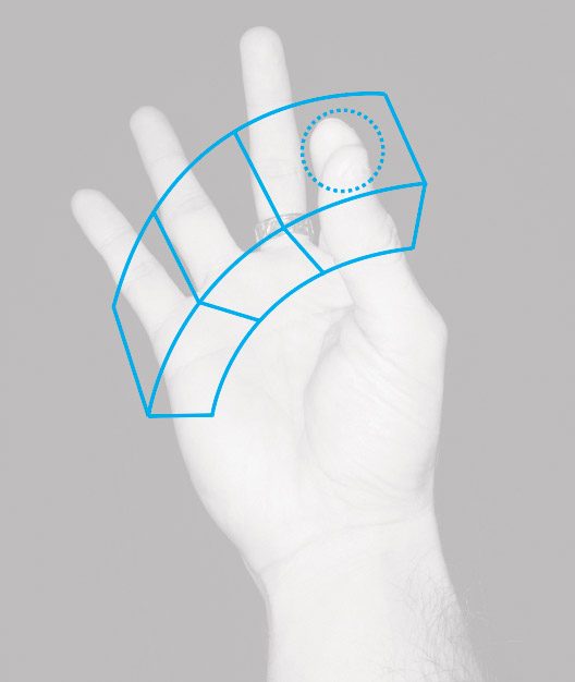
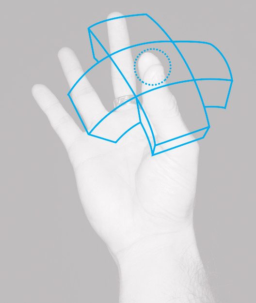
From these movement patterns, we sketched out a few spatial selection systems which would let a user move their pinch point to choose a shortcut option, then release their pinch to confirm their selection. One was based on trigger volumes where the Powerball would move 1:1 with the user’s pinched fingers. When released within a volume, it would confirm a selection.
The arc volumes and translation volumes concepts.
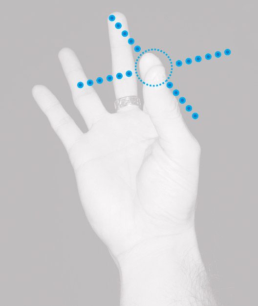
The other was based on a rail system where the Powerball would attempt to move with the user’s pinched fingers but remain constrained along the rail, snapping between dots along the rail’s length.
The arc rail and translation rail concepts.
We then prototyped three of these sketches; the arc volumes, the arc rail, and the translation rail. In testing we again discovered benefits and issues with each system which weren’t apparent from the sketches alone.
Variant #1: Arc Volume
In the arc volume system, our first prototype, determining how to anchor the volumes proved difficult. With the Powerball pinched to open the shortcut system, we first tried spawning the volumes in world space, locking them in place wherever we had originally pinched. We’d rotate our pinch through the volumes into the one we wanted to select, and then release.
One drawback with this method was that it required that you avoid translating your hand much. To ensure that users could move comfortably, we anchored the volumes to your hand so they would move with it. Now the volumes were oriented along three axes when they spawned – one pointing forward from the hand, another pointing inwards, and a third pointed toward the camera.
This system was now relatively fast and comfortable to use. However, the volumes themselves were quite busy and made it difficult to discern the location of the Powerball, and whether it had moved from one volume into the next. Assigning colors and animating the currently selected volume out as an extrusion helped, but it still felt like a lot of overlapping information.
Variant #2: Arc Rail
Next we prototyped the arc rail system. It solved some of the previous system’s issues right away. By constraining the Powerball to dots along a rail, users were free to rotate their pinch inward and down along whatever curve they felt was comfortable. The Powerball remained locked to the rail and the snapping showed its progression more clearly than freeform movement through volumes.
The rail system also removed a lot of the visual clutter of the volumes. But we still needed a way to clearly convey the currently selected shortcut option – especially when the system was in the user’s peripheral vision. We decided to infuse this information into the Powerball itself through an extruding blendshape animation driven by pinch strength.
We also started experimenting with where the Powerball would live on the back of a user’s hand as well as its shape, looking to afford pinching more clearly. This led to the Poweregg.
Much better! Now you could pinch, rotate inward, and down in whatever way was most comfortable. You could also clearly see which shortcut you were selecting, and release your pinch to confirm.
The only remaining functional issue with this system was that to reliably select the middle shortcut option, you needed to move quite deliberately so as not to overshoot into the last option. You also needed to look at your pinched fingers to do so. Choosing the first option or the third at the end of the rail didn’t require this, and as a result were much quicker and more reliable. Taking this into account, we set about prototyping our third system, the translation rail.
Variant #3: Translation Rail
In this system, since we were translating our pinched fingers and not rotating them, we decided to lock the translation rails in world space upon the initial pinch. Unlike with the arc rail system – where all three shortcut options were accessible along the same direction of movement – this system designated a different direction for each shortcut.
By doing this, we ensured that a user could choose a direction and corresponding shortcut without the need to be deliberate about how far they translated their pinch. This selection action was fast, reliable, and didn’t require precise movements, or even that the user look at their pinched fingers. We also modeled and animated the Powercube – a squishy shapeshifting cube which morphed into a tiny pinchable accordion and back again to give more visual feedback at each stage.
This system felt embodied and spatial in exactly the way we had imagined a hands-based shortcut system in VR should feel. Using the system repeatedly built up muscle memory of how the options were organized, a critical component of a successful shortcut system. It could easily handle four options or could be expanded with rails going up or down for a total of six options. The spherical volume around your initial pinch position could theoretically be sliced up in even more ways to accommodate as many options as needed.
That wraps up the first section of our single-handed shortcut sprint – but our work here wasn’t done yet. In order to properly validate our translation rail shortcut system, we needed to test it in a few more areas. We needed to ask how learnable the system was for new users. Would they try to press the Powerball while it was on the back of their hand and if so how could we either avoid affording that action or embrace and use it? What kinds of affordances did we need to guide users through each stage of the system? How could we load information into their visual and audio channels to create an even greater sense of tactility and draw their attention to where it was needed?
Finally, how well did the system hold up while actually using our hands to do something else? Did the system enable easy mode switching while in the middle of actual tasks? Would the system trigger accidentally and get in the way when we didn’t intend it to? Watch for our next blog post where we attempt to answer these questions – and others we didn’t even know we needed to ask.


