Softwhere?

The hardware and power under the hood will mean notably better looking games and apps on Quest 3 in due time, but at launch we’re not seeing nearly the full potential of the Snapdragon XR2 Gen 2 chip, or really the Quest 3’s hardware as a whole.
The reasons for that are multifaceted.
For one, developers have been building their games and apps for the last three years to target Quest 2’s hardware. Yes, there’s some easy visual improvements that we’ll see on Quest 3 thanks to increased resolution (especially for developers who have implemented auto-scaling), but there’s so much more that goes into ‘good graphics’ that needs to be in place in order to see the full power of Quest 3’s processor and display.
Reluctantly Crouched at the Starting Line
It’s going to take developers some time to roll out basic app enhancements with quick and easy improvements (like higher quality textures), but it’ll take a whole new generation of apps before we really see what Quest 3 can do.
That didn’t have to be the case. Meta could have worked with developers much earlier to make sure there was a substantial amount of Quest 3 content primed and ready to go on launch day. Alas, Quest 3’s headlining apps—Assassin’s Creed Nexus VR and Asgard’s Wrath 2—aren’t due out for a month or more. For now players can play a handful of apps that have gotten ‘enhanced’ updates, and there’s surely more to come, but exactly which apps have or haven’t received even an initial enhancement for Quest 3 is not easy to identify.
Better Passthrough That Still Falls Short
Quest 3’s passthrough view is much better than what was on Quest 2, but it’s still far from what we might call sufficient.
When looking through passthrough and keeping your head perfectly still, the image actually looks decent. But as soon as you move your head the world blurs significantly and loses detail. There’s a strange effect where things snap into sharper view as soon as you stop moving your head—seemingly something beyond just the motion blur. I’m not sure if this is some kind of motion-aware sharpening or something else, but it’s funky looking.
Another funky looking thing in passthrough is anything near to the headset, including your hands. Your hands always have a warped-looking distortion bubble around them. And if you rotate your head while having your hands in front of you, your hand will stutter to an incredible degree. (Please excuse my messy workshop)
These artifacts look worse in the headset than they appear above because they also include incorrect depth cues.
Coming Soon
Then there’s the fact that Quest 3 doesn’t currently support occlusion. That means anything that’s rendered virtually in passthrough—even things that are supposed to be far away from you—will render on top of your hands and arms, creating a depth conflict. If the noise, hand-warping, and motion blur didn’t break the immersion of the passthrough, the lack of occlusion definitely will.
Developers are hacking their way around this by rendering a virtual hand on top of the virtual content (using hand or controller tracking) which can mask the issue, but it’s still pretty odd looking.
Blinded By the Light No Longer
If there’s one redeeming quality of Quest 3’s passthrough: it’s much better at adapting to different exposures. Compared even to Quest Pro (which was regularly blown out when there was anything bright in view), Quest 3 can adapt much better to bright objects, even going as far as being able to easily view a bright light bulb that would otherwise hurt if you looked at it with your real eyes. [Note for historians: this is a real sentence about the benefits of looking at things with a mediated view of reality rather than your real eyes. Certainly the beginning of cyborgism as you will eventually come to know it]
Practically speaking, with Quest 3 you can actually mostly read your smartphone or computer screen:
Whereas on Quest Pro this was nearly impossible:
It’s not great (especially due to the hand warping), but being able to glance at your phone or even quickly reply to a text message through the passthrough view is a nice convenience and represents an important bar crossed for genuine usefulness.
Even without using mixed reality (laying virtual content into the passthrough view), having a decent passthrough view is a nice benefit as you don’t feel like you’re blind whenever you have the headset on. ‘Double-tap to enable passthrough’ also works more smoothly that before, with a simple transition that’s (so far) way less jarring than on Meta’s other headsets where the view could stutter significantly during the transition.
Better passthrough also makes the onboarding experience better. Quest 3 finally enables passthrough by default, making it easy to put on the headset first and then find your controllers. It also makes setting up an initial boundary a little better since the view is clearer.
A Very Mixed Reality
Passthrough alone is useful, but of course we also have ‘mixed reality’. This is a major value-add of the headset—judging by Meta’s marketing. But the reality is the tech still feels experimental. It’s another place where Quest 3 at launch day isn’t coming even close to its potential.
The headset is now capable of a ‘room scanning’ feature that generates a coarse mesh of your room. It’s pretty magical to see it in action as the map slowly clings to the world around you as you look around.
Quest 3 also has the ability to automatically suggest a playspace boundary based on the scan, but I found the suggested boundary surprisingly inaccurate—so much so that I’m worried people will occasionally trip or smack their arms on things that are too close (if not inside of) the automatically generated boundary. Yes you can manually adjust the boundary after its automatic placement, but the headset doesn’t explain to users how critical it is to make sure their boundary is correct.
In theory this room scanning mesh will allow games and apps to be aware of your surroundings (or at least the shape of them), so they can interact more naturally in mixed reality. For example, using the mesh, a virtual ball could roll across your desk and fall off the edge. Or you could hide behind your couch for cover. Quest 2 and Pro kinda sorta had these features but could really understand the position of manually placed walls and bounding boxes for furniture. The room scanning mesh is a key step toward making mixed reality possible with much less user setup.
Unfortunately the tools to actually make this happen are just starting to roll out to developers. And it will take time for developers to learn the capabilities and limitations of those tools before they can even begin to design interesting games that will work with them. Even then, it’s going to take a lot more on the tools side to make mixed reality really sing—like scene understanding and segmentation, so games can identify common objects like chairs, tables, and couches, and use them as part of the game design.
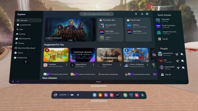
For now the smattering of mixed reality apps that exist essentially just use passthrough as a background, which is… fine? I guess it’s nice to solve puzzles while feeling like I’m sitting in my real room instead of a virtual room. It would be one thing if the Quest interface was extremely streamlined and made it easy for you to multitask with immersive and flat apps side-by-side; but Meta is far from that reality right now.
So for the most part, the big mixed reality feature Meta that has been touting for Quest 3 is missing real and immediate value, aside from the benefits of passthrough capabilities that are now better but not great.
Basically the only app that’s currently showing any of this future mixed reality potential is Meta’s First Encounters demo app which has little critters breaking into your room and crawling all over your walls, ceiling, and furniture.
Particles and visual effects bounce off of the things in your room, and the critters can even convincingly crawl behind your couch out of view. No doubt, the effect of mixed reality when done this way can look really magical and feel quite immersive. It just needs a lot longer to bake before there’s apps that really take advantage of it.
Quest 3 Review Summary

So you’re probably sensing a theme here. Quest 3 on launch day delivers pretty great hardware, but its true value will take time to emerge. Not just time for developers to update and launch new apps, but for Meta to improve its mixed reality tools and streamline the underlying Quest UX to make it more consistent and easier to use.
To Meta’s credit, the company has substantially improved Quest 2 over the course of its lifetime in both features and performance. So even though Quest 3 is more expensive, it’s the room for growth that makes me comfortable recommending it over Quest 2. I’d say give it one year and Quest 3 will really be coming into its own.
Even so, Quest 3 is the best standalone headset to date even if you forget about any of the mixed reality potential. There might not be new killer app content at launch, but it does make existing content an overall better experience. That will be increasingly true as more apps are updated with an initial pass of Quest 3 enhancements.
Note: Quest 3 continues to support PC VR via Quest Link and Air Link. I’ll be talking more about Quest 3 as a pure PC VR headset in future coverage.
Disclosure: Meta provided Road to VR with a Quest 3 headset.


