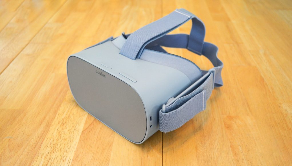
Nearly seven months after its announcement back in October 2017, Oculus Go, the company’s first standalone VR headset, is finally here. The company’s thesis is that this affordably priced unit, which doesn’t rely on a docked smartphone, will make for a more seamless mobile VR experience. But does it go above and beyond Gear VR? Read on to find out.
As usual, we’ll start with a summary and then dig into the details below.
Oculus Go Review Summary
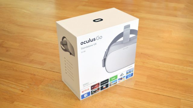
Launching today in 23 countries, Oculus Go is the company’s new take on mobile VR. Aimed for affordability and ease of use, the headset is priced at $200 for the 32GB model and $250 for the 64GB model. The headset shares the same Oculus content store and overall software experience as Gear VR.
Rather than relying on a docked smartphone like Gear VR, however, Go has everything built right in, meaning you don’t have to sacrifice your phone’s battery (or your ability to easily access texts, calls, and the like) just to scratch your VR itch.
Hardware wise, Go runs a less powerful chip than what you’d find on the latest Gear VR compatible phones, but Oculus says the standalone design means they can crank the performance higher thanks to better thermal performance, and a handful of other optimizations.
Oculus says you can expect two to two and a half hours of battery life while watching video, or one and a half to two hours of battery life while gaming. Anyone hoping to use Go as the ultimate personal media escape on long haul flights better pack an external battery. But be aware, Oculus doesn’t recommend charging the headset while using it, likely due to added heat buildup.
Compared to Gear VR, the Go uses a different type of lenses (Fresnel) and display technology (RGB-stripe LCD). The result is a slightly wider field of view, and generally improved overall clarity despite a few drawbacks. Unfortunately, few apps are optimized enough to truly take advantage of the lenses and display, leading many experiences to look and feel worse than the kind of gaming content you’d expect to find on a smartphone.
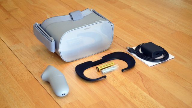
The headset comes with a spacer which increases the distance between the lenses and the user’s eyes to more comfortably fit glasses. There’s also clip-on brackets around the lenses which Oculus says will eventually be used for a prescription lens add-on.
The Go headset feels solid and well built, and is roughly the same weight as Gear VR. Thankfully Go includes stereo speakers hidden in the headstrap which offer decent enough audio to keep you from bothering with headphones in most cases. However a 3.5mm jack means you can plug in for more discrete listening and better audio quality any time you’d like.
The Go headset and controller offer 3DOF tracking (only rotation), which makes the headset best for seated use. Both have very little latency. The controller’s shape feels more refined than the Gear VR controller that came before it, but generally works the same—you’ll see it inside the headset where it will be used mostly for laser pointer-like interactions, as it is limited to 3DOF tracking.
A new companion app for Android and iOS devices helps to set up the Go headset, and also allows you to browse the Oculus content store and install apps without putting on the headset.
Working from the same library of apps as Gear VR—which has been around for a few years now—Oculus says Go has “more than 1,000” apps to choose from, but the number is a red herring—apps that look and play well are few and far between, and Oculus’ convoluted Home interface makes finding them a chore. There’s also a lot of traditional ‘flat’ and 360 media available, but the former doesn’t greatly benefit from being in a headset, and the latter has few truly compelling offerings which end up being spread out across various 360 content apps, many of which don’t offer pre-downloading for maximum quality.
With few standout apps, and an experience which isn’t appreciably different from what Gear VR has been offering now for several years, Oculus Go’s hardware and ease of use improvements feel like they would have been more alluring in VR’s early days—meanwhile in 2018, Go looks like a tough sell against other compelling portable entertainment devices like Nintendo Switch.
– – — – –
Oculus Go In-depth Review
Hardware
Compared to its Gear VR brethren, Oculus Go makes a big change in lens philosophy, moving from smooth lenses to Fresnel lenses. Oculus calls these lenses “next-gen,” and says that they’re an improvement across the board over the lenses in the Rift. Practically speaking, the shape is refined and the Fresnel ridges are more pronounced than those on the Rift.
Looking through the lenses, the field of view is a bit larger than the 2017 Gear VR, and feels comparable to the Rift. It’s clear that distortion (warping), which is easily visible with Gear VR’s lenses, has been almost entirely eliminated on Go, though it isn’t clear if this is due to the new lenses or something in software. In place of the distortion however, Go’s lenses introduce ‘god-ray’ artifacts, which look light faint streaks or glares of light that are most noticeable when looking at bright objects against a dark background. The god-ray artifacts do seem to be a bit more subtle than they are on the Rift.
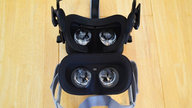
The focus ‘sweet spot’ (the area where things appear sharp) feels adequately large on the Go. Like Gear VR, there’s no IPD adjustment, but unlike Gear VR, Go doesn’t have a focus wheel. Presumably Oculus felt the eye-box of the lenses was large enough to remove the focus wheel, and that seems to hold true for my eyes at least; things looked perfectly sharp for me (though I don’t wear glasses).
Speaking of glasses, Go comes with a glasses-spacer: a rubber gasket which can be inserted behind the headset’s facial foam, increasing the lens-to-eye distance to make room for glasses. It’s a little awkward to install, so you won’t be putting it on and taking it off for each user if you’re passing the headset around, but it’s good to have the option. The lenses now also have detachable plastic brackets which Oculus says are designed to allow perception lenses add-ons to be attached; they say partners will be making prescription lenses for Go, but haven’t offered much detail on that just yet.
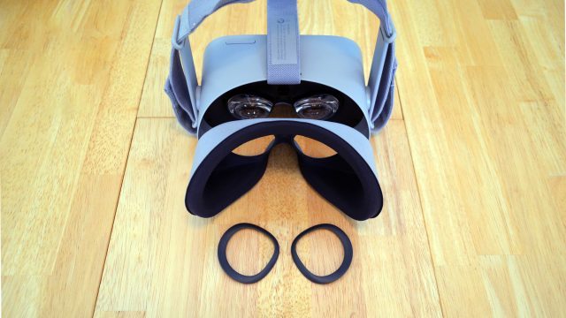
Because I don’t wear glasses, I tested it with two pairs of sunglasses. Even without the spacer, these seem to slide nicely into the Go, whereas one of them doesn’t fit in the Rift, meaning there’s generally speaking more room for glasses overall.
Chromatic aberration (a slight separation of colors) on Go feels about the same as Gear VR—which is pretty bad compared to higher-end headsets (though it isn’t clear if either Go or Gear VR are doing any software correction for this)—and actually you’ll probably notice the chromatic aberration in your peripheral view before the focus falloff. When it comes to chromatic aberration, red appears to shift the most as it moves from one end of the lens to the other, causing large red objects to visibly shift as you move your head. Generally this isn’t an issue but may stand out in a few specific cases.
Then there’s the display, which is also a pretty big change—while both Gear VR and Rift use OLED displays with a PenTile subpixel arrangement, Oculus Go uses an LCD display with what appears to be a typical RGB-stripe subpixel layout. It’s the same 1,280 × 1,440 per-eye resolution as Gear VR, but the Go’s screen has better fill factor (less unlit space between pixels) which serves to reduce the screen door effect (the grid like pattern that’s seen when there’s a low fill factor).
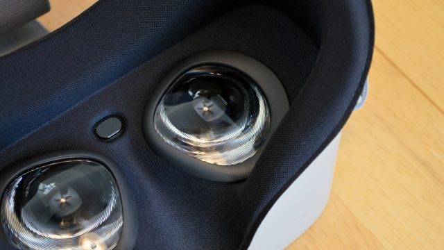
However, even though there’s less unlit space between pixels, the RGB-stripe subpixel layout is more uniformly aligned, and that means the screen door effect takes on a more defined grid-like appearance compared to PenTile where the subpixel layout prevents perfectly continuous black lines. So while the fill-factor improvement helps reduce the screen door effect, the Go’s subpixel layout causes the improvement to be a bit less than it would be otherwise.
But, there does appear to be another slight benefit to RGB-stripe over PenTile on the Go, which comes in the form of what ultimately looks like a slight increase in sharpness. RGB-stripe tends to be a bit better for text and edge rendering in many cases. Furthermore, Go’s LCD screen has essentially zero ghosting, whereas the OLED displays on Gear VR and Rift show lots of ghosting in high contrast scenes.
Like Gear VR, the Go’s display runs at 60Hz, but can optionally be pushed to 72Hz, which can increase brightness and saturation. However, this mode is more demanding from a performance standpoint so it’s likely only to be used by highly optimized and lightweight applications. Compared to Gear VR and Rift, the Go’s display is lacking some contrast in both brightness and color.
Even though both Gear VR and Go run at 60Hz generally, I noticed occasional flicker on Go which I don’t generally see on Gear VR. Everyone has different levels of sensitivity to flicker, but especially in very bright white scenes, I could see and feel the flicker on my eyes with Go. This becomes more pronounced as you increase the brightness, so don’t crank it all the way up if you can help it. The more visible flicker could be due to the Go’s screen, or it could be due to the increased field of view (as your peripheral vision is more sensitive to flicker), or perhaps a combination of both.
LCD displays typically have very minimal mura (inconsistencies in color and brightness from one pixel to the next), while OLED generally has worse mura. Knowing that, I was surprised to find that Go’s display does show some notable mura, maybe even slightly worse than what’s seen on Gear VR. Thankfully, neither are glaring, but mura doesn’t influence clarity.
So between the new lenses and new display, there’s a number of tradeoffs being made. The net change is a slight improvement in overall clarity when comparing Gear VR to Go, and a slightly larger field of view too. I would prefer the view through the Go, but it isn’t a night and day difference.
Design & Ergonomics
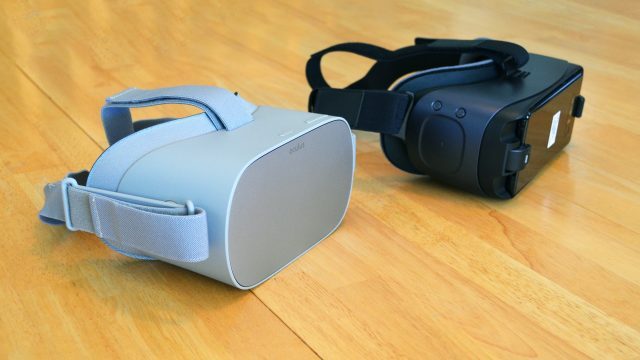
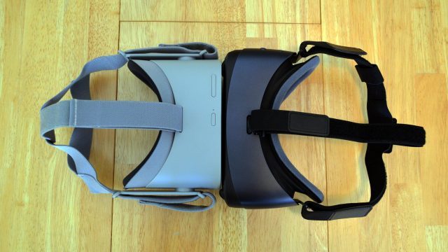
Not surprisingly, considering its standalone design, Go feels more solid than Gear VR. It’s a combination of slightly more premium material feel and less moving parts. The biggest hardware differences between the two are that the Go lacks the side trackpad of Gear VR (which has largely been overshadowed by the Gear VR controller anyway), and also adds built-in stereo speakers.
Gear VR could technically play audio out of the docked phone, but as you can imagine, the quality was poor and it was mono only. Headphones were essentially required for an immersive experience. Go, on the other hand, has hidden speakers which emit sound from small slits in the headband, and sounds surprisingly good considering that the sound is resonating through a plastic chamber before reaching your ears. It’s not going to hit the spot when it comes to pristine music-quality audio, but for general gaming or media consumption, you can definitely skip out on fiddling with a pair of headphones. For movies, highly immersive games, or more private listening you can still plug in via the 3.5mm audio jack.
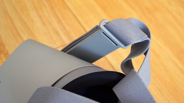
At 468 grams, the Go is slightly lighter than Gear VR’s ~500 grams (varies based on phone), but the difference feels mostly negligible. The Go uses a similar head-mount strap which goes around and over the top of the head, except the back part is split into two sections which cups the back of the head a bit more and generally helps the strap stay in place. The hard arms that connect the strap to the headset rotate completely around, making it easy to vary the weight distribution between your brow and your cheeks, or to rotate the strap out of the way for quick and easy ‘hand-held’ viewing without having to fully remove it.
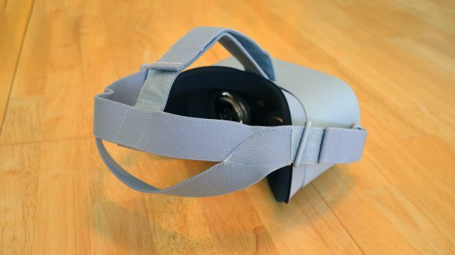
Go is notably front heavy (as is Gear VR), but comfortable enough for me to way for long spans of an hour or more without needing to remove it. Adjusting the tilt of the display housing, the top strap, and ensuring that your side straps aren’t overly tight is key to achieving a comfortable wear. I found that the Go’s foam better fits the contours of my face compared to Gear VR, and also leaves more room for my nose to breath (literally and figuratively). The roomier nose area comes at a price—you be able to see out through a small gap, but I found it easy to ignore this (and actually found it handy to peek at my phone on more than one occasion without removing my headset).
All in all, the Go is a bit more comfortable for me (though your mileage may vary based on the shape of your head and face), and the built-in audio is a smart addition which makes the headset easier to use.
Tracking & Controller
Like Gear VR, Oculus Go is a 3DOF headset, which means it can only detect rotation; turning and tilting your head work fine, but if you lean forward or try to duck down, you’ll find that your perspective is fixed in space, which makes both headsets most suitable as seated devices.
Go may be 3DOF, but the tracking latency is effectively imperceptible, just like Gear VR. I didn’t have any overt issues with drift, but that’s probably because I was frequently recentering my controller anyway (which also recenters the headset).
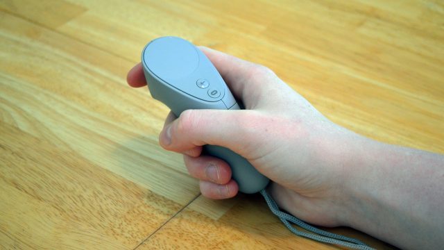
After a few years of using the side-mounted trackpad, Gear VR eventually launched a 3DOF controller which most apps now treat as the expected input device. Go lacks the trackpad entirely, so its controller is indeed the primary (and only) input device. Just like Gear VR, Go’s controller is 3DOF, and functions almost identically, offering a trackpad on top, a trigger, and a few buttons.
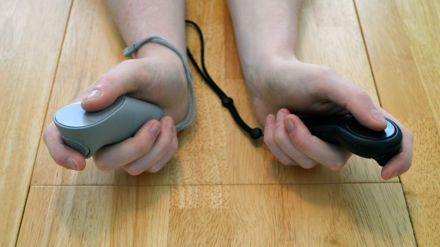
Inside the headset you’ll see a model of the controller, and as you rotate it, it swings around in space almost as if it were 6DOF, but really its movement is just being interpolated as if it was connected to a static elbow joint. Since it isn’t truly positionally tracked, you can expect that it will regularly drift, especially if you’re moving it around a lot. Get used to recentering the controller by holding down the Oculus button, because it will become part of every experience.
Go’s controller shape feels more ergonomic to me than Gear VR’s, and the trigger actually has a little bit of trigger action (rotation around a point), rather than being a big button. It doesn’t mean anything in practice, but just adds to the overall slightly nicer feel. Unfortunately, the Go controller doesn’t have the volume buttons that the Gear VR controller does, which would have been handy. Instead, there’s volume buttons on the Go headset itself, but they’re a little awkward to push; having them on the controller would have been better.

