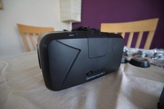
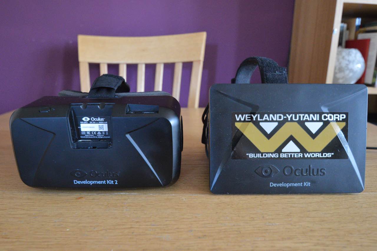
The long wait is over, the next generation Oculus Rift is here and it’s a giant leap over what has come before. The second iteration of Oculus VR’s VR Headset, the Development Kit 2 represents the culmination of many months of cutting-edge research and progress since the company released its DK1 to Kickstarter backers back in March 2013.


Other inherent advantages of OLED are a potentially infinite range of contrast – as every element of an OLED panel individually emits light, no backlight is required (as is the case with LCD panels) which means that when OLEDs are not lit, the panel is completely dark. This means that black should appear black (dependant on lighting conditions), and therfore perceived contrast levels are boosted hugely. Colours too should appear more vibrant.
In real terms, this means that (within the cameral’s field of view) the system knows where your head is in 3D space . You can now move your head up and down, downwards and backwards relative to the camera and a DK2 compatible application can adjust your view appropriately, allowing you to lean in and out of a scene or lean left and right.
Anyway, enough of the theory – what’s it like in practice?
Inside the Box and Unit Build and Comfort Impressions
The DK2 takes a different approach to the DK1 in terms of connectivity. Whereas with the DK1, the Headset itself held only the display, lenses and IMU – the DK2 integrates the guts of the DL1 breakout box, into the headset itself. This means that you have a single, integrated cable running from the headset, splitting into USB (for tracking data) and HDMI (for video). It’s a refreshingly uncluttered approach and means there’s less chance of cable tangle.
The headset unit itself feels like a quality component with high quality plastics used throughout with a good level of fit and finish. The camera too, a custom designed and built device as a solid quality feel. Nice touches, such as the braided cable sheath (DK2 to USB / HDMI) and minimalist simplicity of the camera are appreciated.
Physically, the DK2 feels very much like the DK1 to wear, light and comfortable although (despite what looks like extra ventilation) still a little warm over long periods on a summers day.
The retraction assembly is almost identical to DK1, with two rotatable dials each side to bring the display and lens assembly close or further from your face. The lenses themselves are slightly larger (and flatter on the user facing side) and there are now only two sets (A, fitted as standard and B). The device feels slightly more comfortable in place and I found it easier to wear glasses whilst in VR than with the DK1 – although you still need to be careful as you put it on.


