‘Step Into Rift’ had been Oculus’ mantra since the launch of the headset back at the end of March, but with the launch of Oculus’ dedicated motion controllers, Touch, players can finally ‘Reach Into Rift’ too.
Touch has been a long time coming. Oculus has been criticized for launching Rift with a packed in Xbox One controller back in March, while competitor HTC Vive launched just a few days after with a pair of motion tracked controllers in every box. There’s no doubt about it, having your hands tracked in VR is not just a more natural way to interact in VR, it’s more immersive too. Vive users have known this from the beginning, and now, 8 months later, Rift users will too.
As usual, we’ve got the summary up front with an extensive breakdown following for those who want to dig in.
Summary
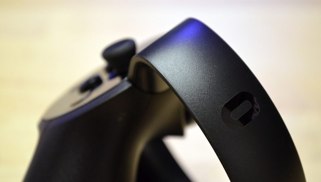
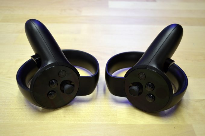 Oculus Touch is (finally) here. There’s no denying the controller’s beautiful design which also has several smart touches—like a hidden magnet-latching battery cover and easy lanyard removal. The ergonomics are a major step forward, thanks largely to a center of gravity which is much closer to the center of your hand than the Vive controllers.
Setup is simple and polished, and with two cameras you can achieve the same ‘roomscale’ sized playspace that Oculus recommends for a 3-camera setup (though it will be for front-facing experiences only). Additional “experimental” camera configurations allow for a roomscale space that’s also 360, or a standing-only 360 experience which feels rather limiting.
[gfycat data_id=”DefinitiveUnderstatedFennecfox” data_autoplay=true data_controls=false]
Tracking performance within the recommended tracking space is extremely good, and we couldn’t break tracking no matter how fast we shook the controller. Venturing outside of the recommended playspace leads to quick dropoffs in tracking quality. More than two cameras can be used, but in our experience the extra cameras added occlusion redundancy more so than they managed to increase the size of the recommended ‘roomscale’ playspace, which is a good deal smaller than that of the Vive. We’re also not sure how many developers will opt to target the full roomscale recommended space when they can instead guarantee that all Touch users at least have two cameras for the front-facing setup.
‘Hand Presence’, which Oculus had drummed up as a sort of differentiator against the Vive controllers, doesn’t seem to be a clear cut advantage for Touch. Sure, the controller’s ergonomics are great, and much preferred over the Vive’s wand design, but both controllers feel equally capable of making you feel like you’re using your hands in VR.
Adding Touch (and the extra tracking space) to Rift makes VR more natural and immersive. You’ll feel like you’re reaching into and interacting with of virtual world instead of just looking, as you might have before with just a Rift and a gamepad.
With 53 launch titles there’s plenty to choose from and while we haven’t been able to play through the whole library, there’s already a number of early standouts with several exciting titles on the way in 2017.
Hardware
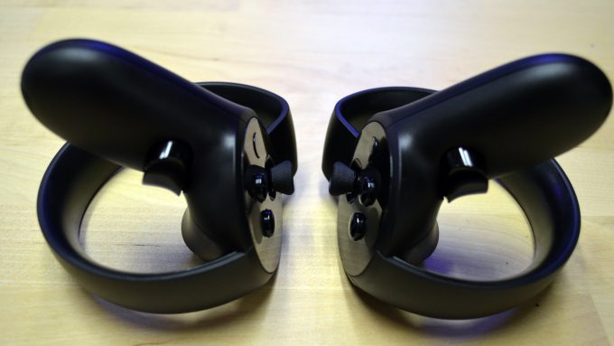 We used the word “elegant” to describe touch back when we first saw it more than a year and a half ago, and while the controller has changed somewhat, its elegance has remained. Touch is a impressively designed piece of hardware that feels great to hold.
Unboxing
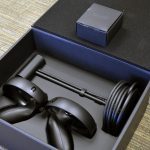
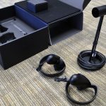
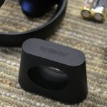
Inside of every Oculus Touch box you’ll find a left and right controller and an additional Oculus Sensor to compliment the one that came with your Rift headset (it should be noted that this Sensor has the same 2.5m cable as the one that comes with the Rift, while the standalone $79 Sensor comes with a 5m extension cable).
The box has a white sleeve on it, much like the one that shrouded the Rift’s velvety black case. While the Rift case was crazy-nice, you’ll find the well constructed cardboard Touch box to be more standard fare. It’s nice enough to store and show off your controllers when they aren’t in use, and thought it doesn’t have a handle, it’ll work fine as a carrying case to get the kit to and fro.
A tiny box attached to the top of the Touch box’s lid houses a mini documentation booklet, AA batteries, and a Rockband VR adapter which can holster Touch to a Rockband guitar; a weird thing to come with every box, especially given that Rockband VR isn’t a Touch launch title, but at least you’ll have it if you need it.
Design & Ergonomics
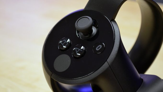 Oculus Touch is a beautiful and—as we’ll say again—elegant device. Your hands will feel right at home the moment you grip them.
Compared to the Vive controllers, Touch isn’t just smaller, it crucially keeps the controller’s center of gravity very close to the natural center of gravity of your hands. The result feels much more natural when moving and manipulating the controllers than the wand- or tool-like feel of the Vive controllers.
The more compact design also means you can get your virtual hands closer together, which makes them quite a bit less likely to collide with your headset as you swing your arms past; something which can happen often with the Vive when the in-game hand model isn’t rendered, with the extra ‘tracking donut’ extending some way beyond your physical hand location.
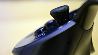
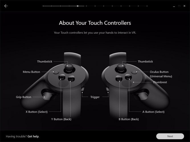 Each controller feels like a solid, integrated unit, and this carries through to the buttons, sticks, and triggers. The face buttons have good travel and seem to have just a hair more resistance than what you might find with an Xbox or PS4 controller, though button presses feel good nonetheless. The menu buttons are much shorter, and almost flush with the face of the controller, making them easy to differentiate from the other buttons even when you can’t see the controller. The controller’s joysticks feel top notch as well and are surrounded in a rubberized pattern for grip, similar to that of the Xbox One controller.
 The trigger has an interesting indent that comfortably fits the joint of the last two segments of your index finger. With your thumb up top and index finger on the trigger, your remaining four fingers will find their way around the body of the controller, with your middle finger resting lightly against the ‘hand trigger’, which is frequently used for grabbing objects (while the index finger trigger tends to be used to activate them). The hand trigger has a very light touch and a good bit of travel, making it easy to press and hold for extended periods.
Each Touch controller is powered by a single AA battery, which Oculus says can last for up to 30 hours of gameplay. The battery compartment is smartly hidden as part of the controller’s seams. You’ll be able to slide the outside grip portion of the controller away to reveal the battery compartment. Rather than a screw or a snap to hold it in place, the cover slots in thanks to a magnet. A nice touch, as it not only removes the need for screwdrivers, but also the risk of breaking or wearing down a plastic tab. Another smart bit of design: rather than having the lanyards attach with a tiny loop that’s nigh impossible to remove without tweezers, the lanyard is held in place with a plastic plug that hides inside of the battery compartment. To remove the lanyard, open the battery compartment and remove the plug (but for god’s sake, leave it on—you or someone you know will throw the controller, it’s only a matter of time).
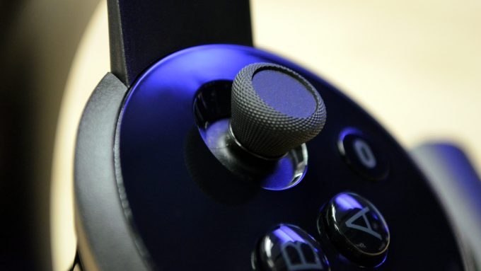 Touch’s design is impressive and beautiful throughout, but I can’t quite understand why, in typical Apple fashion, they insisted on making all the parts your fingers touch in glossy black plastic which shows your fingerprints so easily. The face especially—which has one small matte segment that doesn’t suffer the same fate—looks pretty the first time you open the box, then it will remain smeared with finger oils for the rest of eternity.
Setup
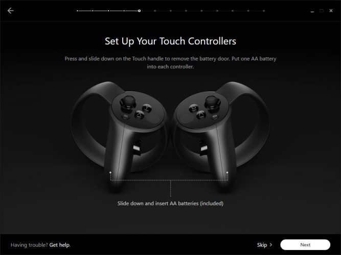 Like Rift, Oculus put a ton of time into making a polished setup experience for Touch. Once you plug in your second Sensor, you’ll be prompted to configure Touch, which will walk you through Sensor placement, controller syncing, and Guardian (boundary) setup.
Setup is pretty simple and it’s something you should get used to, as you may want to play with different Sensor configurations to see what suits your space best. The default setup that Oculus recommends consists of two Sensors spaced 3-6 feet apart directly in front of you. You’ll probably be tempted to point them inward, but one of the steps will have you adjust them so that they’re facing nearly parallel to one another. Having two Sensors, it seems, is less about getting ‘stereo’ tracking, and more about expanding the available tracking volume. Note: you won’t be able to get through Setup with just one Sensor.
One of the steps during setup will ask you to pair your controllers. Fortunately, unlike some generic Bluetooth devices you may have used, this is nearly seamless. You’ll be prompted to hold the menu and one of the face buttons on one controller until a white LED starts blinking. From here the controller will be found, synced, and get a wireless firmware update if needed. You’ll do the same with the other controller before moving on to configure your boundary.
Guardian Configuration
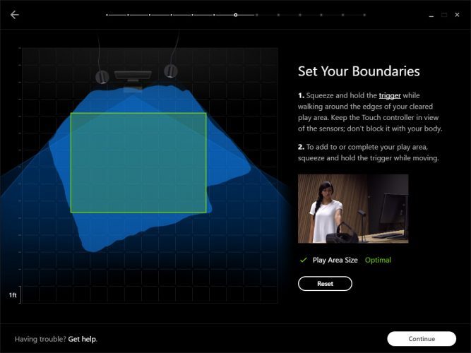 Using a Touch controller, you’ll map out your available playspace. Holding the trigger down while setting the boundary will constantly buzz the controller to let you know that it’s still being tracked. If you lose tracking, the buzzing will stop. This, combined with feedback from your monitor (which shows the field of view of each camera), makes it easy to map out all available space while also figuring out how far the tracking boundaries extend.
After you trace around the available space, the system will automatically place the largest available rectangle within the bounds, which is where you’ll want to define your ‘center’ in the next step.
Based on the size of the rectangle, the setup will tell you if you have a space that’s smaller than the Minimum (3 x 3 ft), Moderate (between 3 x 3 and 7 x 5 feet), or Optimal (anything more than 7 x 5 ft).
We’ll talk more about the performance of this tracking space with the front-facing, 360, and room-scale camera configurations in the Performance section below.

