Other Stuff
Universal Menu
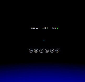
The universal menu can be launched at any point by holding the Back button above the trackpad. This brings up a menu with a row of buttons across the bottom: Oculus Home, Passthrough Camera, Reorient, Do Not Disturb, Brightness, and Comfort Mode.
The Oculus Home button takes you back to Oculus Home, naturally. Passthrough Camera turns on the Note 4’s camera, allowing you to see through to the outside world. Reorient redefines your forward-direction, though oddly enough the button is offset from center. Oculus might take into account exactly how far offset that button is, and factor it into the reorientation, but it would seem more intuitive to have the reorient button directly in the center of your view. Do Not Disturb can be toggled on and off, suppressing calls and notifications. Brightness has a slider to control the screen brightness using the trackpad, though I’ve never felt the need to make an adjustment. Comfort Mode makes the screen give off warmer colors, sort of like f.lux, though again I’ve never felt the need to use it.
Passthrough Camera
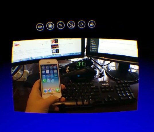
The Passthrough Camera button activates the camera on the Note 4 and projects its view of the real world into the virtual space. The projected view is set correctly to the camera’s field of view, which gives it the appearance of being a little window into the real world. It’s kind of weird, given that it’s much more limited in field of view than your actual eyes, and it lacks 3D so you have no sense of depth, but it’s very useful and I think people will absolutely want something like this on the Oculus Rift consumer version (CV1).
The Passthrough Camera makes it particularly easy to grab a controller, put on headphones, interact with people, or even eat sushi, all without taking the headset off.
I only wish there was a faster way to enable it, maybe a double-tap and hold on the back button?
I could definitely see VR enthusiasts asking Samsung to include a wider field of view and 3D camera on the Note 5 to make the passthrough camera even more useful.
Notifications
I had figured that the easy way for Oculus to handle notifications would be to simply suppress them completely. To my surprise, they’ve tapped into Android’s notification system and present them right inside VR as they come. For the most part it’s read-only; there’s currently no way to see more than the message type (email/text) and a tiny preview. But at least you won’t miss that crucial email while immersed in VR (unless you want to shut out all signs of the real world by enabling Do Not Disturb).
Even phone calls are represented in VR. You’ll see a green phone icon appear to the top left of the forward position. Looking at it will expand to show the caller, phone number, and a contact photo. Sadly, calls can’t be answered in VR, but you can dismiss them by looking at the red icon and tapping on the touchpad.
See Also: Samsung Gear VR Detailed Review: Part One – Design Comparison to Oculus Rift DK2
Between Part One and Part Two, we’re now up to 7500 words on Gear VR—and there’s still more to say. Stay tuned for Part Three, where we’ll dig into the performance of Gear VR with items like battery life, heat, and head tracking.
Questions? Drop us a line below.


