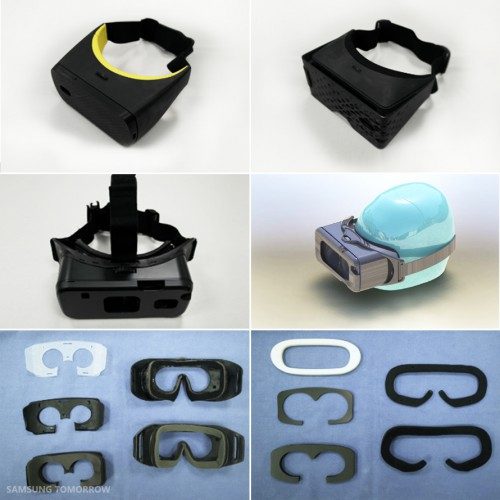
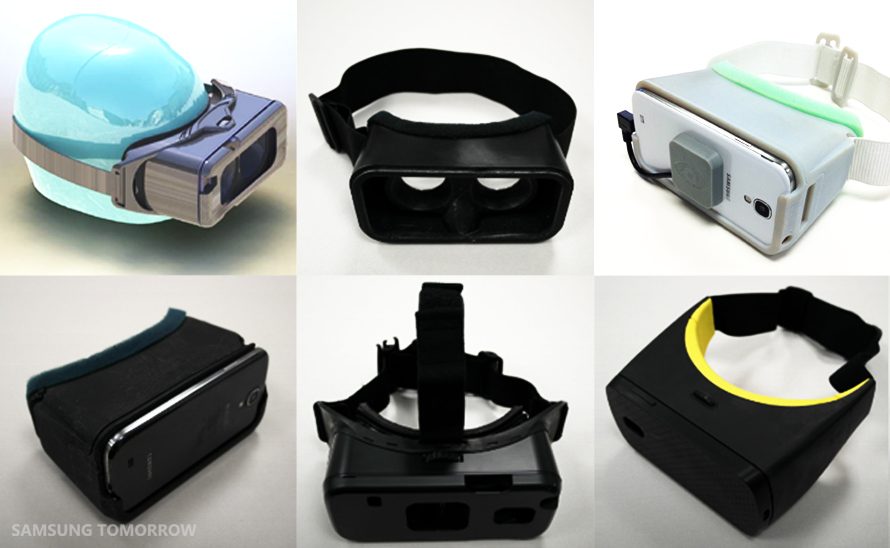
Details have emerged about the evolutionary past of Samsung’s Gear VR, offering a look at the formational stages of the device’s history. The pictures show some prototype design concepts that explore an interesting relationship between the smartphone and the VR headset.
See Also: Samsung Gear VR Detailed Review: Part One – Design Comparison to Oculus Rift DK2
We consider ourselves practical people. We appreciate function over form. But in the world of consumer electronics, the aesthetic is oftentimes just as important as the base functionality, and when a company wants to reach the sort of people that aren’t looking so close at the spec sheet, they’ll also make something pretty and streamlined—something consistent with their brand image.
Here we take a look at the awkward teenage years of the Samsung Gear VR headset, a virtual reality device that uses the Galaxy Note 4 to drive the level of VR experiences that up until now were only possible on ‘tethered’ displays.
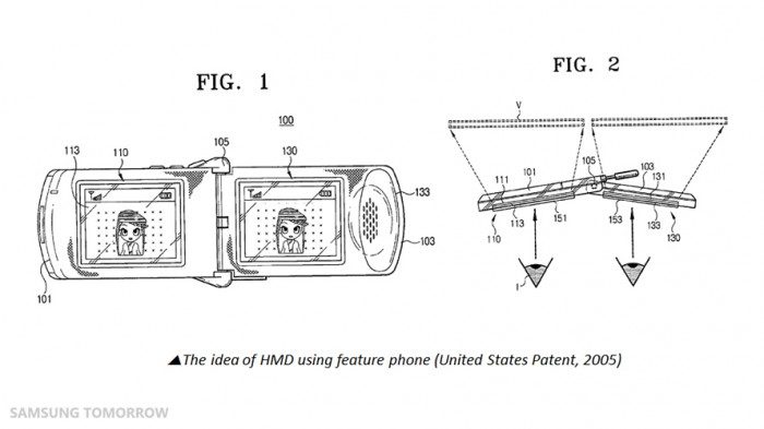
Provided by Samsung’s official blog, Samsung Tomorrow, we learned that the Gear VR prototypes weren’t always intended to fit the Note 4 as its target device. Actually, Gear VR wasn’t the first time Samsung kicked around the idea of virtual reality. The company’s blog entry reveals that they’d considered the idea of a feature phone-driven VR headset as far back as 2005, but the technology just wasn’t ready for a seamless experience.
It wasn’t until 2013 that Samsung started cobbling together a set of designs centered around the Galaxy S4’s 5-inch Super AMOLED screen, a leading feature phone at the time that might have promised the company’s first dive into the newly budding VR market.

But according to Samsung, “the performance and the display (despite the Galaxy S4 display being Full HD) were not sufficient yet. On the bright side, [we] learned several other critical elements in the VR headset technology: speed and accuracy in tracking the head, a display with super-fast reaction , and GPU optimization,”—a key distinction between the current rash of plastic Google Cardboard variants that just can’t offer the Gear VR’s specifically optimized sensor array and software stack for improved reaction time.

However once Oculus partnered up and the Note 4 came into the picture, the first smartphone deemed worthy enough of delivering the crucial MTP (Motion to Photon) latency of less than 20ms, the prototypes departed from the bargain bin aesthetic and started to incorporate more premium features like a focal adjustment dial, touchpad (not visible in any prototype) and removable foam inserts.
Although we don’t have any more specifications than what’s shown here, when comparing the final product to the prototypes, it becomes apparent that heat management became a larger issue than initially planned. Samsung’s decision to stick with a removable face plate (that is entirely useless) may be an effort to strike a balance between the two extremes; one being entirely closed but stylish, and the other open but decidedly cheaper-looking.
In either case, hiding the hardware and avoiding unsightly port and camera cutouts is a smart addition to the company’s design language, which although not a perfect solution as evidenced by Gear VR’s face plate, could potentially attract more curious newcomers to virtual spaces based on visuals alone. And when Mark Zuckerberg says that Oculus will need to sell 50-100 million VR devices to become a “meaningful” platform, we’ll need all the numbers we can get.


