Widget Stages, States, and Shapes
Now that we have a resizable 3D grid with the ability to show ghosted object positions before snapping them into place, it’s time to bundle this functionality into a widget. We wanted to be able to use multiple Scaffolds and to be able to let go of a Scaffold widget, have it animate to the nearest surface, auto-align, and auto-expand its handles on landing (phew!). To manage all of the state changes that come with this higher-level functionality, we created a Scaffold class to sit at the top of the hierarchy and control the other classes.
For this functionality, we have a simple state machine with four states:
- Anchored: All of the Scaffold’s features are hidden expect for its graspable icon.
- Held: The Scaffold’s grid and handles are shown. We run logic for finding a suitable surface.
- Landing: When the Scaffold is let go, it animates and aligns to the closest surface.
- Deployed: This is the main, active state for the Scaffold grid and its handles.
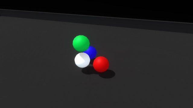
The pre-deployment anchor stage is the fully contracted state of the grid when it might be attached to a floating hand menu slot or placed somewhere in the environment, ready to be picked up. In this state we reduced the widget to a 3D icon, just three colored spheres and a larger white anchor sphere.
 Once you pick up the icon widget, we move into the holding/placing state. The icon becomes the full featured widget, with its red, green and blue axis handles retracted. While holding it, we raycast out from the widget looking for a suitable placement surface. Rotating the widget lets you aim the raycast.
When a hit is registered, we show a ghosted version of the expanded widget, aligned to the target surface. Letting go of the widget while pointed toward a viable surface animates the widget to its target position and then automatically expands the axes, generating a 3D scaffold.
The deployed widget needed a few features: the ability to resize each axis by pushing or grabbing the axis handles, a way to pick up the whole scaffold and place it somewhere else, and the ability to deactivate/reactivate the scaffold.
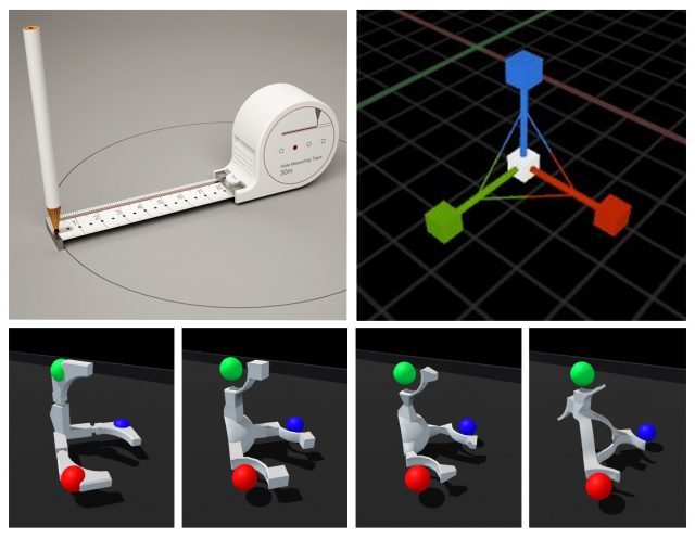
The shape of the widget itself went through a couple of iterations, drawing inspiration from measuring tapes and other handheld construction aids as well as software-based transform gizmos. We honed in on the important direct interaction affordances of the axis handles (red, green, and blue), the anchor handle (white), and the implied directionality of the white housing.
 The colored axis handles can be pushed around or grabbed and dragged:
The whole widget and scaffold can be picked up and relocated by grabbing the larger white anchor handle. This temporarily returns the widget to the holding/placing state and raycasts for new viable target positions.
And with a flick of a switch the axes can be retracted and the whole scaffold deactivated:
Now we finally get to the fun part: stacking things up and knocking them down! The grid unit size is configurable and was scaled to feel nice and manageable for hands—larger than Lego blocks, smaller than bricks. We modeled some simple shapes and created a little sloped environment to set up and knock down assemblies. Then we worked towards a balance of affordances and visual cues that would help a user quickly and accurately create an assembly without feeling overwhelmed.
When your hand approaches any block, its color lightens slightly, driven by proximity. When you pick one up it will glow brightly with an emissive highlight, making the ‘grabbed’ state very clear:
As you bring a held block into the grid, a white ghosted version of it appears, showing the closest viable position and rotation. Releasing the block when the ghost is white will snap it into place. If the ghost intersects with an occupied space, the ghost turns red. Releasing the block when the ghost is red simply won’t snap the block into the grid, letting it drop from your hand.
Once a block is snapped into the grid, notches animate in on their corners to emphasize the feeling that they’re being held in place by the scaffold:
The last piece, and perhaps the most important, was tuning the feeling of physicality throughout the entire interaction. For reference, here’s what it looks like when we disable physics on a block once it’s snapped into the scaffold.
Interaction (or lack thereof) with the block suddenly feels hollow and unsatisfying. Suddenly switching the rules of interactivity from colliding to non-colliding feels inconsistent. Perhaps if blocks became ghosted when placed in the grid, this change wouldn’t be as jarring… but what would happen if we added springs and maintain the block’s collidability?
Much better! Now it feels more like the grid is a structured force field that holds the blocks in position. However, since the blocks also still collide with each other, when the assembly is strongly disturbed the blocks can fight each other as their springs try to push them back into position.
Luckily because we’re in VR we can simply use layers to set blocks in the grid to collide only with hands and not with each other.
This feels like the right balance of maintaining physicality throughout the interaction without sacrificing speed or accuracy due to collision chaos. Now it’s time to play with our blocks!
What do you think about this concept for stacking and assembly in VR? What applications would you like to see with this functionality? Let us know in the comments! If you want to try your hand at the demo, visit the Leap Motion blog later this week. We’ll share the demo along with the full deep dive into how it was built.
More From This Series:
- Leap Motion Explores Ways to Make Controller-free Input More Intuitive and Immersive
- Summoning & Superpowers – Designing VR Interactions at a Distance
Photo credits: Leap Motion, CanStock, Medium, Google, Sunghoon Jung, Epic Games


