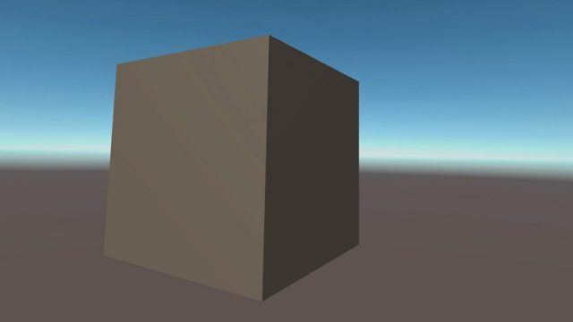
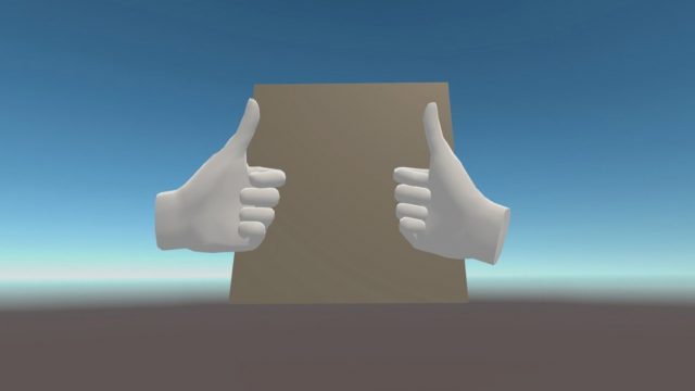
The Unity Cube is an experiment from developer Tony “SkarredGhost” Vitillo to test the limits of what Oculus will allow into the App Lab program. Vitillo submitted a fully functional application which simply presents the user with a cube in a blank environment—and Oculus accepted it.
Oculus App Lab is an alternative path for developers to publish applications on Quest. For a long time the only official way to distribute an app on the headset was to submit it to the main Quest store, but Oculus would only accept applications which meet certain quality criteria, like how much content the app offered to users and whether it was appropriately polished. This made it difficult for experimental and smaller projects to get their app in front of the Quest audience.
Earlier this year, Oculus finally began offering an alternative distribution approach for Quest, called App Lab, which allows developers to submit applications for distribution—without any judgement on quality or scope—with the caveat that App Lab apps aren’t shown in the main Quest store, leaving it up to developers to point their audience to the app’s page.
To test whether Oculus is truly taking a hands-off approach to the content of App Lab apps, developer Tony “SkarredGhost” Vitillo created The Unity Cube. As the name implies, the app is simply a blank Unity environment with a grey cube—that you can’t even interact with. Even at the great price of free, this app would never stand a chance of making it onto the main Quest store. But could it make it onto App Lab?
To Vitillo’s surprise, the answer was yes. In fact, you can download The Unity Cube it right here.


Indeed, it turns out that Oculus won’t judge the scope of App Lab apps, as long as they meet technical requirements and content guidelines (ie: limitations on adult or illegal content, and certain app categories).
Thanks to the experiment, Vitillo also learned some things about the App Lab submission process which he shared in his breakdown of the project. We boiled down his lessons below:
- The App Lab submission process is fairly easy and shouldn’t take more than an hour
- App Lab store page requirement must be met before an app is accepted, including at least five screenshots that all look different
- Apps which request permissions which are not actually utilized (ie: use of microphone) will be rejected from App Lab until the permissions are removed
- Rejection notices are reasonably specific (based on the VRC list detailed here)
- The submission took 5–6 weeks to be reviewed. It was initially rejected for not meeting some technical requirements. After resubmission it took 4–5 days to be approved.
From Vitillo’s perspective, this experiment shows that Oculus is as hands-off as they promised to be regarding the content of App Lab apps.
“Most importantly, Facebook lets you publish whatever you want. I mean, they have published an app with just a cube… this means there is absolutely no content curation. And I’m very happy about it, it means that on App Lab there is a lot of space for freedom and creativity,” he wrote. “I would still like it to be a bit more open, allowing cloud streaming applications and [adult] experiences (both are forbidden at the moment), and I would like App Lab applications to be more visible… but as a first step, I think it’s good. You can publish on App Lab whatever you want. Be brave, I even submitted a cube and I’ve been approved!”

