Augmented and Mixed Reality technologies are rapidly evolving, with consumer devices on the horizon. But how will people interact with their new digitally enhanced lives? Designer Ben Frankforter visualises several ideas he’s had to help bring about the arrival of what he calls the “iPhone of mixed reality”.
Guest Article by Ben Frankforter


While virtual and mixed reality experiences are trending right now (we’ve seen a lot of cool examples in movies), I feel that there’s a lack in convergence of practical interaction patterns. We haven’t seen the iPhone of mixed reality yet, so I decided to explore the user experience and interface aesthetics of mixed reality and share my ideas with the community. My goal is to encourage other designers to think and publish ideas on MR interfaces.
As technology becomes invisible at all such levels, from a perceptual and cognitive point of view, interaction becomes completely natural and spontaneous. It is a kind of magic.
– Alessandro Valli
During our lifetime, we acquired skills that empowered us to interact with our environment. As Bret Victor explains, by manipulating tools that answer our needs, we can amplify our capabilities. We perform thousands of these manipulations everyday, to a point that most of them feel natural. And one of the attributes of good interaction design is allowing Natural User Interfaces: those which are invisible to the user, and remain invisible as we learn them. Some examples of these interfaces are speech recognition, direct manipulation, and gestures.
Apps as Objects
I started by looking into an interaction that felt very natural: browsing records.

- Direct manipulation of the catalog
- Perception of progress while browsing
- Full visual of selected item
- Minimal footprint of scrolled items
I was thinking of a way to apply these principles to an interaction for browsing and launching apps in a mixed reality environment.
Apps as cards
Being virtual, the app cards could grow into various sizes, starting from a handheld virtual device up to a floating virtual display.
Switching Between Apps
It’s an interesting way to open and close apps, but what about switching between them?
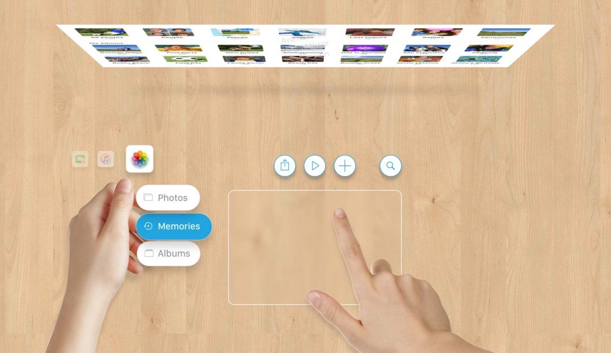
Inspired by Chris Harrison’s research, I explored a system that uses simple thumb gestures to navigate between apps and views. We can easily perform these operations, even with blinded eyes, thanks to two factors: proprioception (awareness of position and weight of our body parts) and tactile feedback (contact and friction applied to the skin).
Proprioception with tactile and visual feedbacks enables switching easily between views.
Tools and Controls
While the left hand controls the basic navigation, the right hand is free to execute other operations by using virtual tools. The result of these operation are displayed in a virtual display in front of the user.
But a planar surface is not always available, and to be able to interact with any environment the user should be able to perform other types of gestures as well. Gestures in mid-air can help, such as framing the right photo.
You can follow Ben Frankforter on Twitter and Facebook as he brainstorms solutions for the future of immersive technology user interfaces.

