In this presentation, given at the recent LondonVR meet up, Cymatic Bruce distills his experiences from over 400 VR demos and games to share his thoughts on what challenges virtual reality poses to developer and what can be done to resolve them.
Designing a Holistic VR Experience
OculusVR recently released a 40 page document detailing “Best Practices” for VR. This document is a compilation of suggestions and advice that will help developers maximize both the comfort and immersion of their creations. It is quite thorough and thought provoking, and is definitely recommended reading for current and prospective VR developers. The document highlights many of the design choices that devs are already adopting, such as slow walk speed, minimal camera control during cut-scenes, and giving the player a body for reference.
At the last LondonVR meetup hosted by Bossa I was offered the chance to speak on VR design. Although my development time has been light, having played nearly 400 VR experiences has given me a decent understanding of what works and what does not in VR, in addition to a sense of trends within the development community. One such trend was particularly bothersome, so naturally it was best suited to be the topic of the presentation. Below is a summary of that presentation, with slides and videos included.
—
The trend that was so bothersome involves the startup and exit of a VR experience. Many titles have incredible content, but unfortunately do little to immerse the player right from startup or ease them out of the experience upon exit. A VR experience should begin as soon as a user double clicks your icon, and that user should be immersed from splash screen to shutdown.
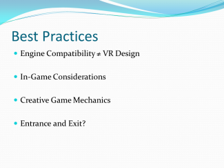
Designing a game for a monitor and a game for VR are very different animals. Already there have been a few development teams that have equated VR support in their game engine to a quality VR experience in their game – that is simply not the case. The motion of the camera, size of the assets, speed of the character, implementation of the UI, and many other elements must be catered to the VR user. VR offers game mechanics that would be impractical or downright impossible on a monitor. For example, rotating your head to determine a shape in Shadow Projection, or turning your truck one way while looking the other in Euro Truck Simulator 2. Fortunately, there is a lot of consideration and creativity from the dev community when it comes to core game content. This is very encouraging! However, we still have room to improve – far too many experiences have intros meant for a monitor and exits that are abrupt and jarring.
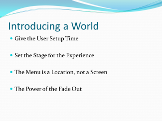
Let’s begin by talking about the introduction of an experience. This is a golden opportunity to introduce the user to your universe, to immediately hook and immerse the user into a new world. As the cliche goes, you don’t get a second chance to make a first impression. The beginning of the VR experience that you design sets expectations for what is to come – for better or for worse. Some of the most useful tools that I have seen so far have been to give the user ‘setup time’ before they begin their experience, set the stage for the experience right from the beginning, treat the main menu as a location, and generous use of the fade transition.
Set Up Time For the User
Jump Star VR is a great example of a game being mindful of a user’s setup time. the game begins in 2D, then transitions to stereoscopic 3D by asking the user to put on their crash helmet. This give the user a chance to adjust their Rift, face forward, and get comfortable. In addition, the action ties into the narrative of the game. In this way, the designer has begun the process of immersion before the headset is even on!
Set the Stage for the Experience
The Gallery: Six Elements is a title that grabs you from the second you start it up. Like Jump Star, the waits for you to put on your headset and push an input button. Once it begins, ominous music and a deep voice boom overhead as you float through the logos and title. This is not a splash screen. This is a carefully orchestrated attempt to remove the user from the reality they are in, and draw them into the reality of the game world. It builds excitement, and primes the user to expect something awesome.
Menu as a Location, Not as a Screen
Time Rifters is a prime example of using the main menu as an introductory location. The concept seems rather simple, but we have a hard time letting go of a standard interface like a title screen. Title screens have been around almost as long as video games have been on televisions, and work so well that they have been relatively unchanged until now. However, it may be time to re-examine this interface. A user in VR is not looking at a monitor, they are in a space. “Options” and “Level Select” are no longer text, but places that your user can go to. A benefit of making your menu a location is that it doubles as a safe space for your player to explore the mechanics and movement within your game world.
Fade In, Fade Out, Fade Plenty
The importance of the fade transition in VR cannot be expressed enough. In modern gaming, much of the visual presentation is influenced by movies. Swooping camera motions and hard cut transitions work fine on screen; it is what we have come to expect. Unfortunately, that same hard cut transition in VR feels like instant teleportation. While this sounds cool in theory, it is very uncomfortable and jarring in practice. An abrupt transition in location – no matter how trivial – should be accompanied by a fade transition. The menu of Hawken is a great example of this: it strings together several slow camera pans with fade transitions in between. I cannot speak for everyone, but I can say that I feel no discomfort whatsoever.
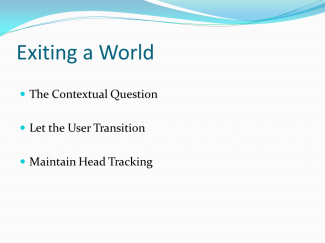
Speaking of abrupt transitions, the exit of VR experiences are almost universally instant. This may be fine if you are using a launcher like VRLaunchPad or VirtualReality.io, otherwise prepare for a jarring transition to whatever is on your desktop. It would be great to see more experiences ease the user out of the virtual world rather than coming to an immediate end. Some recommendations are using a contextual question, allowing the user to control the transition, and to maintain head tracking the whole way through.
The Contextual Question
When a user is ready to quit, a rather amusing way to keep the immersion going is to ask a snarky question that is consistent with the game universe. Some examples might include “Are you sure you wish to stop the simulation?”, or “Removing your space helmet here may be fatal! Continue?” Its fun, its silly, but it keeps the user engaged until the very end.
Let the User Transition
Baud provides a stellar example of a thoughtfully designed intro and exit for a VR experience. When the user is ready to exit gameplay, a menu spawns in front of them within the game space. The user maintains headtracking the entire time, and gets to choose when they want to exit. Finally, the experience ends with a stereoscopic image that prompts you to remove your headset. At all times, the user is driving the experience forward.
Maintain Head Tracking – Avoid the Load Freeze
What you see above is an example of a head tracking freeze. I am moving my head back in forth the entire time, yet there is a second or two where the screen does not move with me. This is something that I find irksome, yet is prevalent in many demos. Some of my favorite experiences – including the awesome Legend of Zelda VR above – freeze for just a second while loading the scene. While this is not a big deal on a monitor, it is very disconcerting to suddenly lose head tracking within the VR headset. A fade transition here would be wonderful!
This is Just the Beginning
After all that has been said, it is important to remember that modern VR development is in its infancy. Many of the experiences I play are tech demos, proof of concepts, and pre-alphas. Even if an experience is rough around the edges, it is reassuring to see that the content uses sound VR practices, and that the gameplay mechanics are fresh – even revolutionary! I look forward to playing 400 more experiences, and being transported to worlds that were once restricted to dreams.


